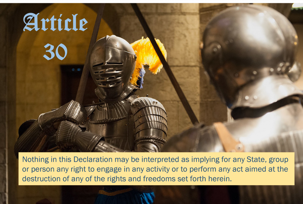
The Last Word “Composite ‘Maximilian’ field armor” by mark6mauno is licensed under CC BY 2.0 This image was created in PowerPoint. Tags: human rights February 8, 2022 by Jane Barrager Student Posts 2


Hello Amy,
Excellent work on the typefaces in the image! The typefaces used in the image support the message of Article 30. The elements blend and work well together, such as the font used for the Article 30 heading and the font used for the article text are different from the heading font and are simple to read and understand. Adding a block behind the text blends well with the color selected and brings out the message in your image. The image selected is perfect for this article, I would also love to learn how you edited it on PowerPoint! I have never used PowerPoint for editing images and only used it to create presentations.
I really enjoy the color choices you made! I love the use of the blues and yellows you see in the knight’s plumes in the text and boxes. The text is also very appropriate for the image you chose. It’s arguably an obvious choice, but sometimes the choice is obvious for a good reason.
Admittedly the contrast between the text for the title and the text of the article are a little jarring. Maybe not something terribly fancy but with a bit more elegance to suit the text in the title.