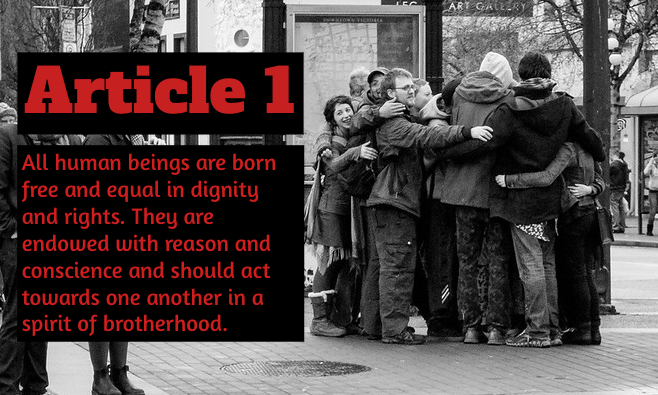
Hug me, brother! “Hug me, brother!” by Emily Madril is a derivate of “Group Hug III” by Joris Louwes which is licensed under Attribution 2.0 Generic (CC BY 2.0). Originally downloaded on 02/08/22 and edited by BeFunky. Tags: human rights February 8, 2022 by Jane Barrager Student Posts 2


Hi Emily,
I like the title you gave this Media Lab. Haha, is it the reference to the Nickelodeon show Drake and Josh? I loved that show when I was younger. I use that phrase on the occasion to my friends.
The typefaces you used in the image supports the overall message. It is simple and fits the theme of what the Article of Human Rights is conveying.
The elements that worked particularly well are the use of box and alignment. I can see that you tried to align the both text boxes with the group of people hugging. It fits perfectly. Not sure if you cropped the image or not, but the text boxes kind of look like the same size in comparison to the group of people to even out the overall image.
The fonts blend well with each other because they do look similar, but not too similar. I can see the texts are within the simple old style typography. I like the way you used these kinds of fonts. Keep both of them simple and easy to read. Don’t want one font too extravagant and overshadow the other text.
A small suggestion is maybe use a different color combination. The colors of red and black kind of reminds of horror or a scary feeling. Maybe that is my own train of thought when I see these two color combinations. I know the image is in black and white and there is not much other colors that might complement each other. The black boxed background is good, but maybe white for text? I know I probably would want to add a splash of color to the make the text pop out more, so maybe that is why you chose red. The Article 1 color combination is fine, but the second text box was kind of difficult to read for me. Overall, it looks great. I really liked the image and your title reference.
Hi Emily!
First of all, the choice of image was excellent. We could all stand to see each other come together a little more, and the image does a wonderful job of exemplifying the article being quoted. The group togetherness shows our universal humanity and the black and white nature of the photo gives it a timeless feel.
I also have to say that the splash of color in the text does a good job of making the article pop away from the rest of the image. And placing the all black background around the text also helps to separate the embracing group. You did a great job in using the law of thirds for the hugging group, too. The fonts seem to go well together, with the only comment I really have on them is that they’re very similar and a slightly more different font for the body text, or perhaps even a different color from the title might have made for a stronger appearance. All and all a wonderful combination.