Painting a Culture “Painting a Culture” by Aleisha Edenfield is a derivative of “Mural Art” by chooyutshing which is licensed under CC BY-NC-SA 2.0. Originally downloaded 2/6/22 and edited with BeFunky. Tags: human rights February 6, 2022 by Jane Barrager Spring 2022 Student Posts 3


Hi Aleisha! I am not in your feedback group this week. However, I did want to say that rhe fonts you selected really fit well with the image. I might would have moved the words a little so it wasn’t right on the border. Regardless, this is definitely a favorite of mine. Great job.
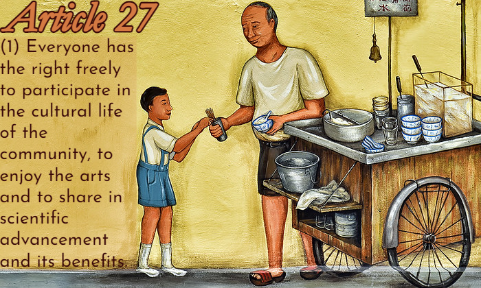
Hi Aleisha,
The typefaces you used in the image does support the overall message very nicely. Although both look different from each other, it works well together. The first text looks modern or maybe decorative. The mural feels like it is showing a story of a simple and happy interaction between the food cart seller and the child. And then when reading the text, it is seems simple and easy to read the fonts too.
The elements that you made worked particular well is the color and contrast of the typography because you used the similar colors from the image and continue to use it in the fonts. Very good choice of color combinations. Easy to read and can feel it ties together the image and text perfectly. The text box has a nice subtle color and helps keep the text contained. Good call on making the Article 27 text multi-color and outlined. It really makes the font pop and stick out more.
Your two fonts blend well with each other and are not too similar, but in the end works well with each other. Nice work using the same or similar outline color from Article 27 text to match the second text. It really complements each other. The difference between the fonts are that the first text seems heavy and serious looking. While the second text looks lighter and smaller and more rounder.
Yes, as Tiffany mentioned in her comment for suggestion for improvement, the text seems like it is a bit too close to the left edge of the image. It is good that you were trying to fit the text to fill in that side, but it seem kind of squished. I might have tried to re-position or resize that font to make it fit a bit better away from the edge. Overall, great job. I can understand why you chose those kinds of font, color, and sizing.
Hey Aleisha! I really enjoyed your post. I like that you chose a painting/drawing for your image instead of a real life image. The first font you used fits perfectly with the cartoonish theme of the image. I also like that you chose the font color to match with the older guy’s skin (I think). It makes for a nice color scheme overall and fits in perfectly. One critique I have (sorry that it is repetitive) is that the words are a little close to the edge of the image. Moving the text box over a little bit would have given the text a little room to breathe and not look so crowded. Additionally, maybe if you cropped the image such that the older man was in one of the intersections of the rule of thirds might have made the composition look a little better but that’s just my opinion. Overall, I think it looks great!! Good job.