
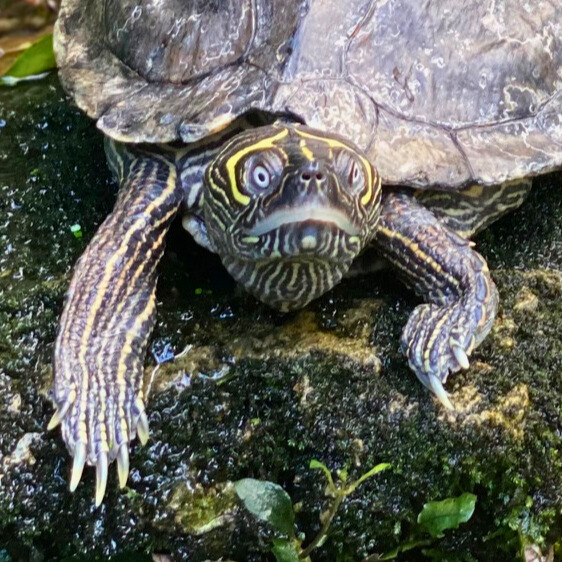
I love this original photo. It shows Mr. Garfield’s environment, on a rock amidst the greenery of the Garfield Park Conservatory . Yet I felt it would be a good candidate for cropping. In the original photo, the subject is in the center of the picture, creating a more static presence. By cropping in closer to his face and erasing much of the extraneous environment, we are able to detect some level of (imagined?) emotion. His big, bulging eyes look straight at the camera, seeming to express “Who, me?” These eyes fall about 1/3 of the way from the top of the photograph, aligning with the rule of thirds. The yellow lines framing his eyes “pop” a lot more when the photo zooms in, creating more of an intimate relationship between the viewer and the image. I chose to crop using the 1:1 ratio because the square shape fit the head and forelegs of Mr. Garfield while still revealing some of his shell and the rock, while using a rectangular shape would have required more shell or rock, competing with the desired focal point of his face.


Hey Karen! First of all, I love this photo. While the original includes a lot of environmental elements like the greenery, water, and rocks, the cropped version really allows viewers to notice the details of Mr. Garfield. His expression, the black and yellow stripes, and even his long nails become the main focus of the image. The golden ratio is also followed really nicely as you mentioned, with his eyes and left arm landing perfectly along one of the one-third lines. Awesome photo!!
Hello Karen, what a wonderful picture of Mr. Garfield—and his name is absolutely adorable. In the original photo, you really get a sense of his little habitat, with the green leaves surrounding him and creating a cozy, natural environment.
In the cropped version, the focus shifts entirely to Mr. Garfield himself. You can see his features much more clearly, and the close-up adds a bit of intensity to his expression, which makes him look just a tiny bit intimidating in a funny, charming way. The crop definitely brings out his personality and makes him the star of the image.
Hey Karen. I love Mr. Garfield. That said, what an amazing transformation. It goes from an image of Garfield in his habitat to a personal glamour shot of Mr. Garfield himself. It looks like you aligned his eyes along the upper 1/3, which really helps to draw focus to his markings, which were barely visible in the original image. I think cropping out the foliage was a good choice because it distracted from the main subject.
Hi Karen! So, first and foremost, Mr. Garfield is adorable! I love how the original image creates the setting, including what looks like his little back leg kicking up in the air. That being said, the beautiful foliage distracts from the star of the show. Your edited image really focuses on Mr. Garfield, and lining his eyes and markings with the upper third of the image really brings out his “What are you looking at?” expression! I also love how the placement of his head and arms mimics the yellow markings on his head, creating this half-circle reminiscent of the golden ratio spiral, from his left arm curled up, following his head to the extended right arm. The only improvement I could see is if there were some way to show off his jazzy back leg (which would be next to impossible, but one can dream, right?). Great photo!