Japanese Bunka “Japanese Bunka” by Jason Rosario is a derivative of “Electric City” by Mark Gunn which is licensed under Attribution-NonCommercial 2.0 Generic (CC BY-NC 2.0). Originally downloaded on 02/08/25 and edited with Apple Photos. Tags: human rights February 11, 2025 by instructor spring 2025 Student Posts 3
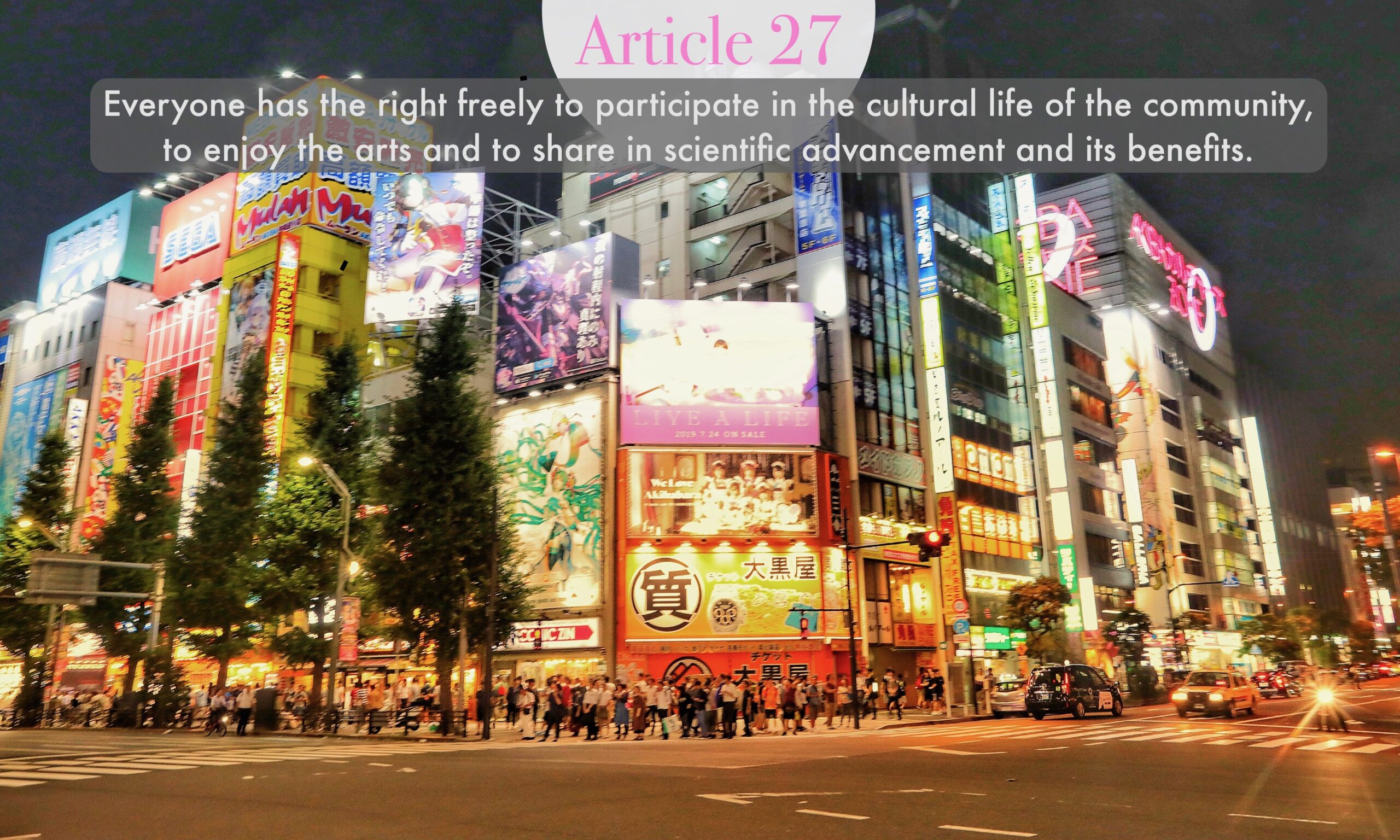


There isn’t a whole lot of contrast between the fonts they used for the header and the main text. The fonts are kind of similar; I personally would have gone with a more special or interesting font, something that’s clearly from a totally different font family than the body text. They’re a bit too alike, but I do think it’s great that they added contrast with the colors in the font and the different colored backgrounds. It’s good how you used see-through (opaque) shapes to make the words stand out from the picture, especially the body text. But I think it might have flowed better to use just one shape instead of two separate shapes for the text boxes. The text could also have been moved to the side or the bottom since it’s very centered at the top right now. Maybe we could use a little bit of the rule of thirds to make the text a focal point.
There is a lot of action and excitement that can be seen in this photo through the bright colors and the crowd of people. However, the font choice for the article title does not seem official, it gives off more of the decorative type vibes. I would like to see what the title would look like with a billboard font, changes to the header’s font color would look like and the use of one shape. The text and the image portray the message and the importance behind the message of life and culture. The color of your font does compliment the bright and bold digital billboards on the buildings. Overall, your image choice is great in terms of composition and perspective, but also really sticks out to the viewer due to the bright colors and action.
Great job, Jason!
Hi Jason! Visually, I love the contrast of colors and perspective your overall image offers–very neat shot selection for Article 27. Generally speaking, I do think the fonts selected do the job…fine. I like the inclusion of transparent elements (semi-circle, rectangular box) to emphasize the text and add extra focus. However, I do think the title could be significantly larger, as they stated in class “if you’re going to make it different, really make it different”. When able, I’d suggest playing with different fonts for the main title, perhaps something a little more artsy or bold to really grab attention. Just some food from thought. Other than that, great job!