“Neighborhood Laundry” by Olivia Sampogna is licensed under CC BY-NC 4.0. Derivative of “A Monday Washing, New York City, published 1900” published by Detroit Photographic Company retrieved from National Gallery of Art, dedicated to the public domain under CC0.
Hello! I used the image editor Canva Pro to create this derivative.
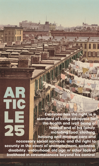


Hi Liv,
I really like how you have incorporated your text onto this image to highlight the message of “Article 25.”
The font choice for the “Article 25” text is a strong choice for the heading, drawing the viewer’s attention. I think the ombre color text color also works very well. It’s very attractive and a lovely feature, especially as it matches the color scheme of the image.
Personally, I find the other font a little challenging to read. I think it might be the size of the font as well as the color of the font against the background. While I do wonder how a different font might work instead, resizing, changing the color, or adding a background to the text may increase the readability.
I do think the image is beautiful, and works very well when paired with “Article 25.” The font placement is great as I think it works really well to draw the viewer’s eye down to the hanging clothes.
Great job!
Hey Liv, I really love the creative route you took when it came to placing the title. The pop of color on the title helps it stand out against the building but still blends with the pastel coloring of the picture. For your fonts, they pair well together even though they are very different. The only problem in your body is the font; it makes it hard to read. The font creates their t’s with a small line across that gets hard to see with the stuff going on in the background. The rest of the text is fine; just the to looks like a lo. Other than that small mishap with the body font, they both fit your image and complement each other.
Hi Liv,
This image is very eye-catching to me, both because of the color palette and the layout. I love how you put “Article 25” on the side of the building! While I like this choice of image and the choice of font for the title, I think that the body font needs to be a little more different from the title font (maybe by choosing a typeface that’s thinner, or one that has serifs), and a little more legible (I had difficulty reading the t’s and E’s in particular). The legibility also might be helped by putting the body text on a less busy part of the background, such as the sky.