
Original image found on Wikimedia Commons: “Palestine sunbird (Cinnyris osea osea) male in flight” by Charles J. Sharp. Licensed under CC BY-SA 4.0. Derivative has been created using Befunky. Image has been cropped, resized, and a text box with text has been added.

_male_in_flight.jpg)
Hello Jennifer,
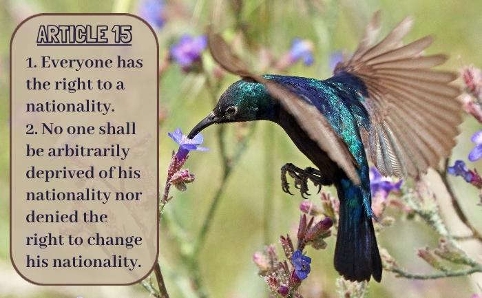
I think you took an interesting approach for your design, creating a compelling narrative by juxtaposing an action shot from nature with an article touching on systems of deliniating nationality. I’m glad the caption for the image points to the name of the bird featured, because it enabled me to do some background research to better understand what you were communicating with your design. National species are fascinating in their own regard because their recognition relies on manmade definitions and political boundaries; the animal kingdom is not confined to the borders and social structures enacted by humans, yet we still imbue them with a sense of national identity and identify with them as such. I could go on and on about the relationship between society, regional identities, and their corresponding ecosystems… You got me thinking!
The color palette and composition of your design is well developed- it reads comfortably and feels suited to the ideas at play. Your fonts work well together without calling undue attention to themselves. I’d say it is a successful piece of typography! As for a suggestion for improvement, I wonder if there is any way to free the text from its bounding box and have it interact more organically with the larger image? I think the background color of the box is helping with readability, so it may be difficult to remove the background without drastically changing the design… In any case, good work!
Hi Jennifer,
I really enjoy the image you chose to juxtapose with your article, and I love the color choices you made for the box behind the text itself! They fit well together, and because they are not starkly different against the background and have some transparency, the viewer doesn’t lose the composition of the original image. I like that you placed the text to the left of the Bird in Flight, as it also keeps the flow of the original image.
I like the font for the Article text, and these two different fonts work well together. The font for “Article 15” is an interesting choice- I do like that it is underlined and emphasized, and its less uniform design calls to the idea of nature (or people) also not being something that easily fits into simple square boxes. I wonder what a stronger font would have looked like, if it would have emphasized the text below or distracted from the image. In any case, well done!
I think it was very creative to use a humming bird to represent this article. We all know hummingbirds move from flower to flower and so seeing that coupled with the article is touching. I love the color scheme you have going. I would however probably change the font.