
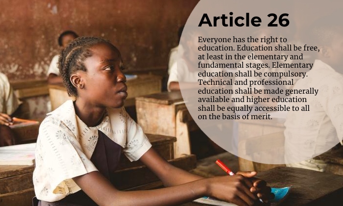
“Child Learning” by Kris DeMarco is licensed under CC BY 4.0. It is a derivative of “Group of Children Sitting at Desks in a Classroom” by Unsplash, licensed under CC0 1.0 Universal.
The image editor used was Befunky. Article 26 is from the Universal Declaration of Human Rights.

Hi Kristopher! I really like the work you’ve done here. I think this was a great image to choose, as it shows the importance of education. I like how you added the little circle background to your text to make it easier to read. For my project, I tried to look for an image with an empty spot so the text would be easy to read, but your method is more creative and opens up more images as options! I think the fonts are different enough to go together well. I might play with the alignment of the text, if I had to suggest an edit. It doesn’t really feel like it’s aligned with anything specifically, but if it were moved over a little it could align with the girl’s pen.
Hey Kristopher,
I think the photo does a great job of highlighting Article 26 about free education. The bubble around the statement works well to draw attention to the message, and the fonts are clear and easy to read. They’re a bit similar, but they still complement each other, one has a more casual feel and the other is a bit more formal, which balances the tone. The placement of the bubble in the top right with the text creates a nice balanced composition, making everything feel well-placed and visually appealing. If I had to suggest anything, maybe playing with more contrast between the fonts or colors could make the text stand out a bit more, like using a different colored bold font with a lighter one for variety or perhaps a color from the photo. Overall, it’s a solid design!
Hi Kristopher! You chose a really impactful image that underscores the meaning of your article really well. I like the color story here too, lots of warm earth tones and then to pop of red from the pen. I think the fonts work really well together, neither overpowers or clashes with the other, and both feel serious and formal. I like what you did with the semi-transparent circle to make the text of your article pop. You also have room here to play with making the circle large or changing the color of one of the fonts to pull in that bright red color.