Citizens of the World The original image is “travel” by fdecomite, licensed under CC BY 2.0. This work, “Citizens of the World” by Jocelyn Hsu, is licensed under CC BY 2.0. “Article 13” is from the United Nations’ Universal Declaration of Human Rights. Image editor used: Canva Pro. Tags: human rights February 8, 2025 by instructor Student Posts 5
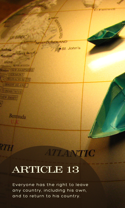


Hi Jocelyn. I like the typefaces used in your image. It reminds me of what you see on a map, which aligns with your photo’s theme as well as the human rights article you selected.
I like the photo that you chose to go with the article. I think it matches particularly well with the wording of Article 13. The color of the circle also paired very well with the photo you selected. The color of the font stood out and was very easy to read.
I think the two fonts blend very well together. I can definitely tell a difference between the two fonts.
Overall, nice job on the pairing of everything.
Hello Jocelyn, I love the image! I think it goes very well with the article you chose. I also think the two fonts you used fit really well with the image too. It looks like old type like you would find on a map in the 1930s maybe. I like the color of the fonts and I do think it goes well with the map, but I think it would’ve been cool if it matched the boats in the image.
Jocelyn this is great work! I would say the font does support the overall message of the article, the header font to me seems more serious as it is sharper and gets my attention that this is serious or legal and then the text font is a bit softer and rounded but still professional. In addition your circle element for behind the text so that the text stands out on top of the globe is great, good color and transparent enough for the text to stand out. I also love the picture, the curvature of the map gives it the feel of looking at an old globe for those of us old enough to remember learning and dreaming over the amazing spinning map of the world, its a really good feel to the photo.
Thanks!
Kiani