Not So Gentle Lullaby This work, “Not So Gentle Lullaby”, is adapted from “Person’s Feet” by Bonnie Kittle, licensed under Unsplash, some rights reserved. “Not So Gentle Lullaby” is licensed under CC BY 4.0 by Mariah Fuertes. Photo Editor: Canva Pro Article 25 taken from The Universal Declaration of Human Rights. Tags: human rights February 7, 2025 by instructor Student Posts 3
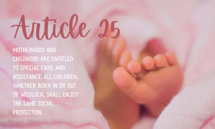


The typeface choice really fits this image well. The body font looks really nice and gentle, and both it and the main header’s scripted font give off the feeling of a baby shower invitation. This works well because it supports the overall message, which is that all children deserve special care and help. It’s saying that whether they’re born in or out of wedlock, they should have the same social support. Overall, you used good colors that seem to be taken right from the image. The header font is a darker pink, maybe picked from the baby’s foot or the blanket. The fonts go well together because they’re different styles, but they both feel like they could be handwritten. If I had any suggestion for improvement, I wonder if it would look better if the body text wasn’t all in capital letters.
Hi Mariah
The fonts complement each other, and the image makes great use of the rule of thirds. However, I agree with Heather on how it gives off the baby shower invitation feeling or vibe. You did a great job at portraying the meaning of the message and getting the point across. Also, I would like to see what other colors from the image might look like in the header along with the Canva equivalent of the drop shadow effect. Overall, I love the color scheme and the way you portrayed the article.
Way to go, Mariah!
Hi Mariah. This is a very creative piece and helps me empathize quickly and easily with the statement you’ve chosen. Your color choice for the “Article 13” font matches the photo of baby girl. Your font styles are a nice contrast and compliment each other without letting the design feel disjointed. I’m going back and forth on whether or not ‘all caps’ should be used for the statement. Also, the white font on the statement over the light pink is having a squint affect on my eyes. Otherwise, you’ve done an excellent job with photo selection, cropping, and placement of the article.