Anyone Can Be Free “Freedom” licensed by Josef Grunig CC By- SA 2.0 – Downloaded 2/6/2024 – Edited by “Befunky” Tags: human rights February 6, 2024 by Jane Barrager Student Posts 3
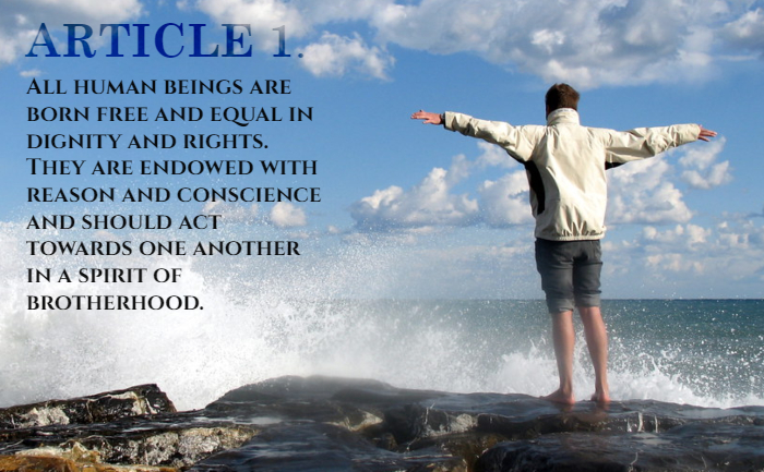


I think it’s really cool how the transparency in the ‘Article 1’ text makes it look like the words are in the clouds. The image really emphasizes freedom in the article chosen. The placement of the text and font choices are great. The font choice is fairly simple and doesn’t distract from the focus at all. It looks like the fonts are the same, but the color of ‘Article 1’ differentiates it in a good way. Blending that into the sky puts more focus on the rest of the text, which is what is more important. The positioning of the text and the size seems to split the focus evenly between the person and the text.
Hi Sharon,
I find the image you selected to go with Article#1 to be fitting. This person standing with outstretched arms makes me think of freedom. They are watching the ocean waves crash on to the rocks, smelling the salty air, and enjoying the sunshine. They are free to choose what they’d like to do, an experience most humans can resonate with.
I noticed a lot of people used a serif font for the word “Article,” myself included, so I like it here. However, it looks like you used the same font (or at least a very similar one) for the text block. I recommend looking into some sans-serif fonts and playing around to find a combination you like!
For an alternative image, I would suggest finding one with more than one person with it. The article touches on the spirit of brotherhood and treating each other with dignity. Perhaps a photo of a person sharing food with another would work here as well.
Also, please make sure you are linking the image’s original poster and the proper CC license within your caption.
Sharon, I really loved how you blended the Article number into the clouds, it made for a very beautiful image. Looking at the image that you chose, the man looks very free and at ease and I think it goes very well with the article that you chose. I also chose that same article because I love what it represents and I feel like we were on similar wavelengths when doing this assignment. Very well done, good contrast and blending of the text with the background. The only critique I’d make is properly linking the original image.