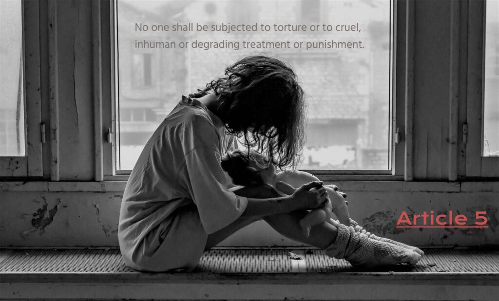
“person black and white girl woman white night” by PxHere licensed under CC0 Public Domain
Note: downloaded on 04FEB2024 edited in befunky

“person black and white girl woman white night” by PxHere licensed under CC0 Public Domain
Note: downloaded on 04FEB2024 edited in befunky

I think that the text blends in with the imagery well and really conveys the message as intended. I don’t feel like the font choices themselves add or take away anything from the message as it’s very simple. However, the color choices do. I like the color choice for the title text and how it blends into the image, but is still very readable because of it’s placement.
The ‘Article 5’ text seems a little out of place to me. I don’t know if it was necessary to make the color contrast that much because it takes away from the image almost and moves your focus from the subject. I also might have put it closer to the title text to show that they go together. Although we know what it is, an outsider might not understand the connection.
Hi David,
This is a very strong photo. Before I even read the text, I already felt saddened by the image. While we don’t know what happened prior to this photo being taken, we can infer that something made the girl feel downtrodden. She may have been subjected to some erroneous punishment and her solace is found with her doll.
Back to the text, I really like how subtle it is! It seems like it would be spoken very quietly, which is fitting for the image. However, I do not think “Article 5” was put in the right place, it looks like it was kind of thrown in when you could have aligned it with the text or window sill. I also believe the two fonts are a bit too similar; a serif font for “Article 5” would have helped to distinguish the elements.
Because of the somber nature of this photo, I can’t really think of an alternative image that would tell a particularly different story. I suppose if you took the article literally, you could have included a photo of someone being tortured. That would have been a little too intense.
David,
I just want to start off by saying wow. Wow to this image that you have chosen to go along with your Article, it’s one that makes the audience think and definitely stirs up some feelings when looking at it. Despite your post being titled “Painless” my heart wept a little at the image you used. The typography is a little jarring since the Article font is different from the font of the other text. I would use similar fonts so there’s less contrast. Speaking of contrast, I would have bolded the text so it’s easier to see against the black and white background. Other than that, I have no additional notes. Excellent job!