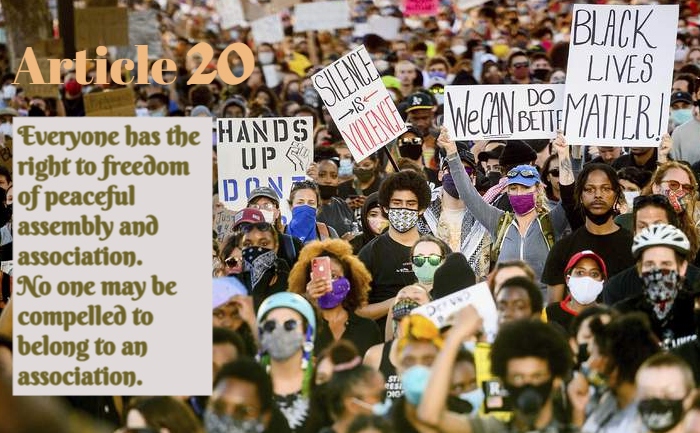
Freedom for All The Right to Protest by Tom Marabello Licensed under CC BY 4.0 DEED Note: Work on the original picture was downloaded on 01-30-2024 and was modified on befunky web page Tags: human rights February 2, 2024 by Jane Barrager Student Posts 3


Hi Abou,
Your image definitely reiterates the message of Article 20. I appreciate that your background color on the article text makes it look almost like another sign being held by the crowd. Thus, I’d say that element worked particularly well. Your article text is readable, and the color of the font is appropriate. That said, while your text is readable for the article contents, I wonder if a different font may have been better. To me, I like that font, but it appears soft and pretty. From what I’ve seen, fonts used in peaceful protests are often dark, intense, and bold because protestors want their messages read loud and clear.
I also struggled to see the “Article 20” text within the image, as the color of the text blends too well with the skin tones in the picture. I don’t think the two fonts are too similar at all, but I would have liked some distinction between “Article 20” and the noise of the background. I think you could have also moved the article message away from the “Hands Up” sign or tilted it to match the other signs. Overall, I think this is an excellent response to the assignment. Thanks for posting!
I am so sorry, Abdu, for using the wrong name when I addressed you in my first comment! I wanted to make sure I rectified the situation since I can’t edit my comment! Have a great day!
Hey,
I found the photo you chose really interesting to look at; it looks almost AI-generated to me. There’s just something off-putting of the way the crowd blends together, some of them look out of place as if they don’t belong. Perhaps it’s photoshopped I’m not quite sure, this is no offense to you, as you’re not the original photographer, but I thought it was interesting.
As for your font choices, I like both of them. I like how you chose the script for the article text it gives it a very formal feeling. I do think a different color for the article title might have helped it stand out a bit better but overall I think the two fonts complement each other well.