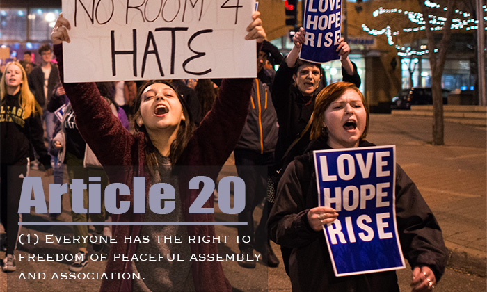
Right to Assemble “Right to Assemble” by Maryann Shirley is a derivative of “Protest march against Donald Trump” by Fibonacci Blue is licensed under CC BY 2.0. Originally downloaded on 01/31/23 and edited with Photoshop Tags: human rights February 2, 2023 by Jane Barrager Spring 2023 Student Posts 2


Hey, Maryanna, thanks for your post! The two fonts contrast well, especially having the article title in sentence case and then the description in an all-caps font. Both fonts reflect the serious nature of the article. I might have chosen a different font for the description that is maybe a bit bolder so it stands out more. I just noticed you actually put a bit of a box behind the text, so changing the opacity of that to make it less transparent could help it stand out more, too.
Hi, Maryann! I really like the energy of the photo you chose, and the light gray box around the text makes it easy to pick out against the background. The article number is in a clear, easy-to-read font (perhaps Impact?) which scans quickly, and fits in nicely next to the protest signs. Its heavy line weight makes for a sharp contrast with the font you chose for the text of the article (Copperplate Gothic?). The small capitals resonate with the signs’ all-caps text, but it is just a bit difficult to read, at least for me; it also scans as very formal, which is incongruous with the protest signs but works well with the seriousness of the Declaration of Human Rights. Overall, this image is very readable and I think this font combination is effective, great work!