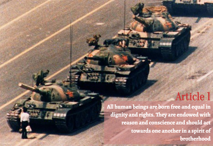
Taking a stand “Taking a Stand” by Latasha Baker is a derivative of “that’s him.” by r y _ _ _ _ is licensed under CC BY-SA 2.0 Originally downloaded on 02/08/22 and edited with Befunky Photo Editor. Tags: human rights February 8, 2022 by Jane Barrager Spring 2022 Student Posts 2


Hi Latasha!
Your overall message of taking a stand in the face of danger/oppression sends a strong message. Your typefaces support it by adding some similarity but also distinct differences that make the reader think. The transparent background behind the white lettering made the text more legible and brings focus to it first. Also, matching the color of the man’s shirt and the red star on the tanks pair well together creating deeper representation. The right align on the bottom around the squared image works well with the image’s free space. Along with color, the two fonts are different enough to create a distinction but blend well together to tell a full story. The title is serif representing more official means whereas the main text is sans serif for ease of readability and demonstrating informal methods. I would suggest possibly making the title font size larger. This would create some more distinction and fill up other image dead space. Another suggestion would be to put the man on the bottom left one-third line to create a stronger focal point and even stronger message. Otherwise, great job!
Good Morning Latasha,
The article you choose to edit is very important. Especially during a time like Black History Month, because there was a time when my ancestors were not free. However, it still applies heavily today because there are still issues with everyone in the United States of America receiving equity and justice simply because of how others view them.
You chose a great spot for the placement of the text in the bottom right corner. The viewers’ eyes are naturally moving in that direction when they are looking at the tanks moving towards the child. So, it makes it easy to read the text and look at the photo at the same time.
I like the image you choose because it shows that the child in front of the tanks is making a statement about how the child has the right to stop in front of the tanks whenever they want. You also did a good job of choosing the color red in the backdrop of the text to match the red in the star on the tank and the white of the child’s shirt for the text. The use of these colors makes everything look cohesive. The font also is very professional and bold so matches the tone of the image. Great job!