Champions of Motherhood “Expertise Saves” by Elizabeth Gerace is a derivative of “Maternal and child health training. Bangladesh 2006. Photo: AusAID” by DFAT photo library which is licensed under CC BY 2.0. Originally downloaded on 02/07/22 and edited with Pixlr Photo Editor. Tags: human rights February 7, 2022 by Jane Barrager Student Posts 2


Hi Elizabeth,
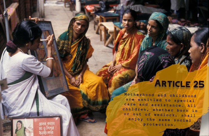
The goal of assignment four was to implement imagery and typography within a digital photo photocard which you completed beautifully. I really like the powerful photo you chose for the assignment. Your photo highlights a group of Bangladesh woman taking part in a training class. What makes your photo really stand out is the excellent use of typography, contrast, and color.
Let’s take a closer look at each of these areas. The typography you use was very appropriate. The font that you used for the copy reminded me of a mother which is very appropriate since the photo highlighted Bangladesh women. I also liked how you use contrast with the Article and copy font to enhance the design features of the post card. The last thing I want to mention is the color. I really like how you used the yellow color as a tint to display the typography on the postcard.
In summary, your photo post card used typography, contrast, and color well, and you met all the other requirements for creative common licensing.
Hi Elizabeth,
Right off the bat, the colors you chose jumped out at me. The colored background for the article blends in nicely with the colorful outfits they are wearing and doesn’t take away the focus of the overall image while still being noticeable. Considering how small the font is, the choice for it to be spaced the way it is made it a lot easier to read. The bold font for the Article itself was a good choice. That font really reminds me of the old science journals I used to read as a kid. Considering that all of the people in this photo are focusing on the teacher, I liked that you chose to put everything opposite of her so as to make sure we can see what everyone’s focus is on. The font doesn’t block anything and blends in well so I can get a clear idea of what is being represented. Great job!