
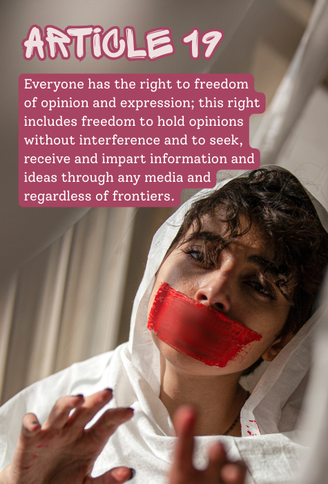
For this assignment I used Canva to crop my selected image and embed the text. For the title text I used Sprite Graffiti which is a decorative / display font. For the body text I used Soloway which is a slab serif font, I also used the highlight effect to add a pick background to the body text. I edited the text to wrap around the image’s subject and aligned I the text to the left.
Hey Nyabi,
I really like the typeface choices you made here. The graffiti style grabs attention right away and pairs nicely with the serif text, it creates a nice visual balance. That said, the color seems a bit distracting and slightly pulls the viewer’s eye away from the photograph. Maybe color-matching the outline or backdrop to the tape over the mouth could help unify the design and strengthen the message.
I also noticed that some of the text overlaps with the subject’s head. Slightly reducing the size or using a more translucent background might help keep the focus on the image. Overall, the layout feels thoughtfully arranged, and the type choices complement the theme well. Great work! Just a few small tweaks could make it even stronger.
For a semi-dramatic image like that, the pink text (not taken from the image itself) and the curved word backgrounds are an odd choice. Matching the text (at least of the title) with the contrasting red tape would’ve been more impactful.
I do like the choice of the graffiti title font with the image. The slab serif is legible, though I personally would’ve gone for small caps.
The word backgrounds tangent with the subject’s head a little. I’d shrink down the body text a touch–the margins at the top and right look nice, so I’d keep them roughly the same.
Overall, not a bad job.
Hi Nyabi! I Like the font you chose for “Article 19;” it has a sort of graffiti and punk feel to it. For the paragraph text, I think the font was well-chosen so that it doesn’t clash with the heading text. However, I do think the pink background distracts a bit from the photo. I would suggest using a font color that doesn’t require a background, or choosing a color that stands out less on its own. You could do this by choosing a color that’s used in the picture, whether it’s a shade of brown or from the pop of red of the tape. I do like that you matched the outline of Article 19 to the background of the body text. On another note, I also wish the text wasn’t so close to the person’s face; I really think moving the text just a few millimeters away would make a significant difference, serving to highlight the subject rather than distract from them.