Friends Being Lectured by Classmate by Ana Vega, licensed under CC BY 4.0
Note: Photograph taken by Ana Vega on March 24, 2021, at 12:53 PM. The image was cropped and edited using PaintTool SAI 2.

Friends Being Lectured by Classmate by Ana Vega, licensed under CC BY 4.0
Note: Photograph taken by Ana Vega on March 24, 2021, at 12:53 PM. The image was cropped and edited using PaintTool SAI 2.

Hello, thanks so much for sharing your work! I think your font choices are clearly distinct from each other, and that the additional color outline helps to ensure they are thought of as separate elements. But otherwise the simplicity of the main body text works well with the more illustrative heading text. I think the font choices match well within the context of the text, and I think the text works well with the image, however, I do think the font choice feels a bit more formal/professional compared to the image and that creates some visual dissonance for me, and while I do think the color on the text works well to differentiate the elements from each other, it does overall make the image a tad busy. I think if I were to recommend changes for improvement, I would maybe incorporate some form of background behind the text so that part of the image doesn’t feel so crowded, or pick a different heading font that fits the overall tone of the image a little better.
Hello Ana,
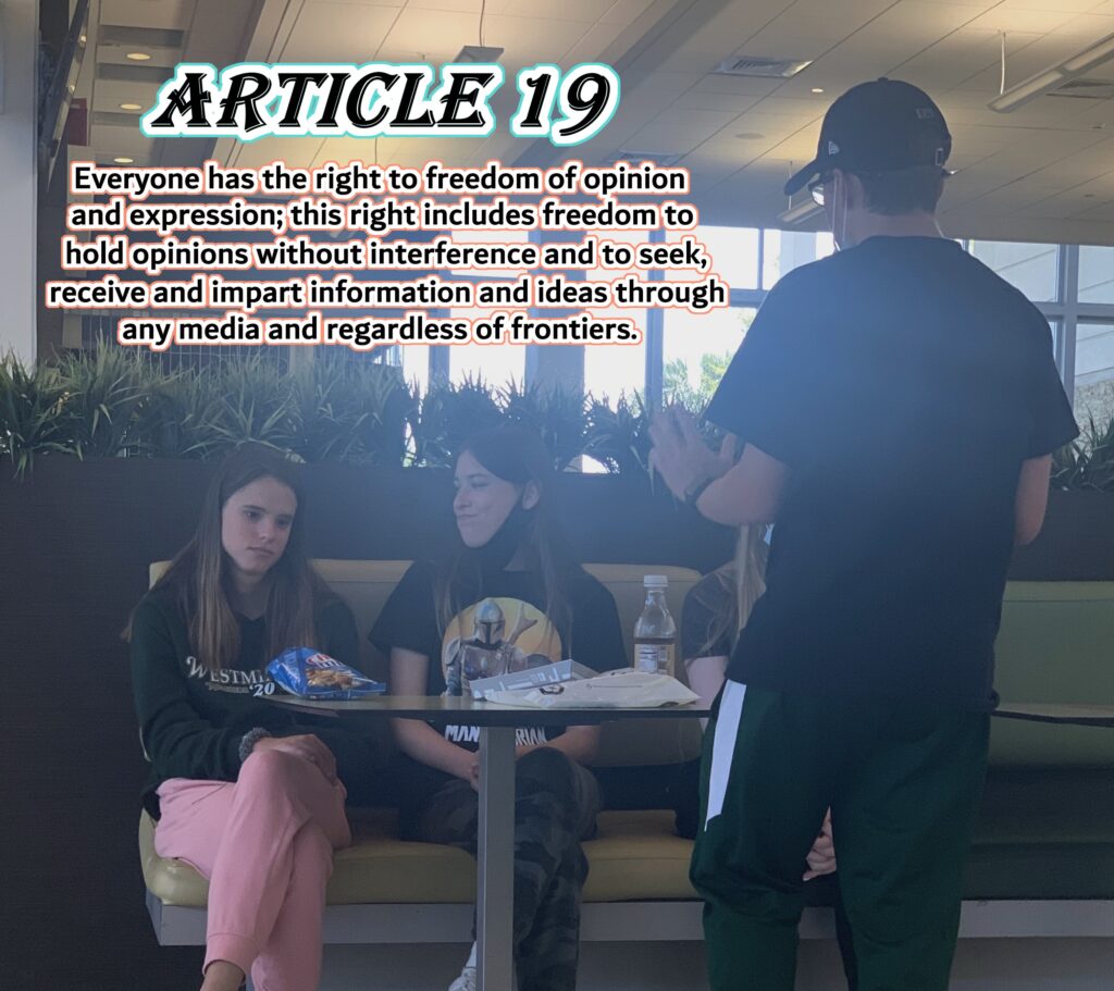
I agree with Nicole about the color outlines—they really help the message stand out clearly and make the visual feel more intentional. I also love the expressions on the people in the image. Their faces capture exactly what the article is emphasizing: everyone has the right to freedom of opinion and expression.
The man’s hand gesture especially caught my attention. It feels symbolic, almost like he’s physically illustrating the idea of holding one’s own opinions without interference. It adds a powerful, human touch to the message and reinforces the theme of personal freedom.
Hi there!
Initially, I was a wee bit bogged down by the color choice for the font. But upon further reading of the Article, it seemed to be on par with the subject matter. I appreciate the way in which this picture articulates so much with so little. The micro expressions of the girls, the gesturing of the guy, the BOLD font choice, and then the explanation. This does well to capture the message of freedom of expression, but specifically the ‘regardless of frontiers’ aspect. I imagine this line is really amplified by the atmosphere of where this “passionate lecture” is taken place (seems to be a cafeteria or dining area of a fast-food place). I think this was an exceptionally good choice for the Article, although my only critique would be to perhaps include some sort of background to the words, so as to physically separate the message from the photo.