ml3

The Story of the Mural

“The Ride” by Jonathan Pupo, licensed under CC BY 4.0
“The Story of the Mural” by Jonathan Pupo, licensed under CC BY 4.0

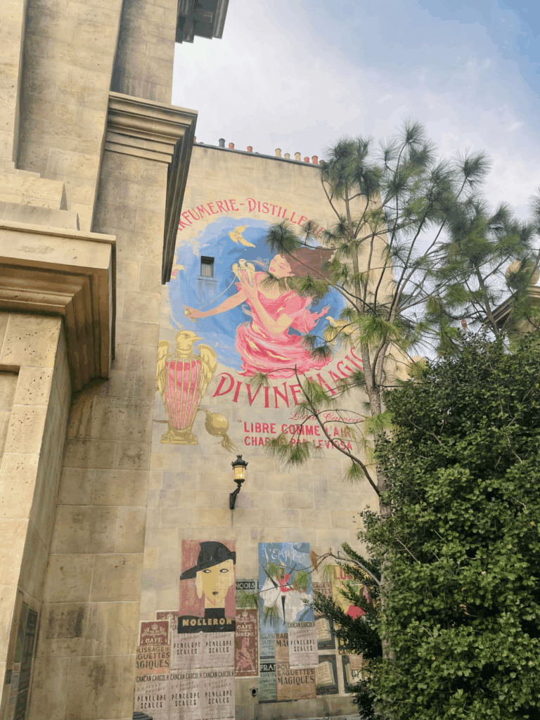
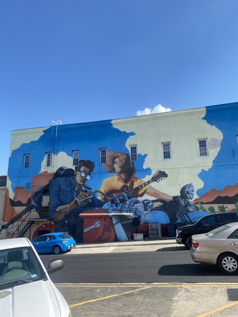
Last year, my brother moved to Denton, Texas and the original photo was taken while we were exploring the city and was taken in an area that is called Denton Square. The mural caught my eye because it was the first thing you saw when exiting the Recycled Books, Records, & CDs store which moved into the historic Wright Opera House which has been there since 1900.

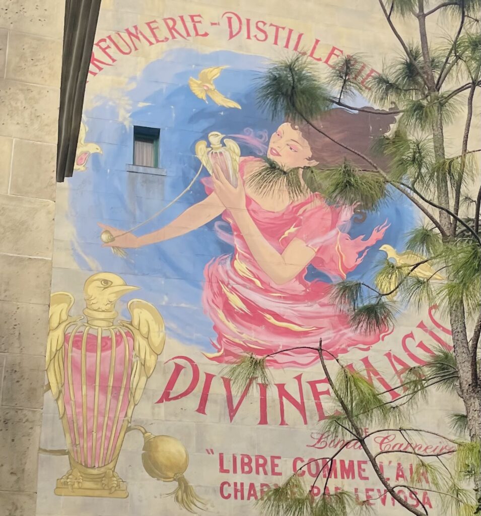
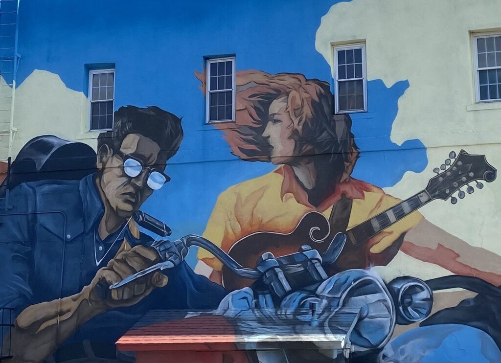
When cropping the original image, I aimed to emphasize the focal point of the mural by narrowing the frame onto the man and woman displayed at the center of the mural, following the rule of thirds. With the cropped image, I was able to remove unnecessary details like the cars surrounding the mural and the empty sky above it. This helped simplify the background to draw more attention to the artwork itself which is the reason I took the picture.

The Cat Crop

Olive at the Door. ©2023. Kenneth Jones. All Rights Reserved
Olive at the Door – Cropped. ©2026. Kenneth Jones. All Rights Reserved

I actually found this post quite difficult, as I usually account for cropping before taking the image. Because of that, it was pretty hard to find one of my own photos that really needed cropping or where the crop made the new image stronger than the original. For this post, I chose this photo of my cat that I took while experimenting with black and white mode on my digital mirrorless Fujifilm camera.

In the original, the image is at a slight slant, which in my opinion adds a more interesting dynamic, similar to Gary Winogrand, who often spoke about tilting the camera slightly. However, in this case, I think it looks more like a mistake than an intentional choice. For this reason, I decided to both straighten and crop the image in a way that stays true to the original while adding a few touchups. I darkened the backdrop, reduced the highlights, and added a slight blue tone to get it as accurate as possible.

Cropping the image also adds a slight mysteriousness, turning the door into a more abstract line that divides the composition between dark and light. The crop subtly shifts the focal point while simplifying both the background and foreground. I decided to keep the copyright under my name for both versions and not license the image under Creative Commons.

Wild and Free in the Badlands

Grazing in the Badlands, 2022, Christy Heiple, licensed under CC BY 4.0
Secrets of the Badlands, 2026, Christy Heiple, licensed under CC BY 4.0

Here in the badlands, where the land is rough and open, the spirit can run wild. Unlike the flowing prairies of North Dakota, the badlands are exposed. Carved into each layer of rock is the story of wind and erosion. It carries the harsh realities of life in the West. Beauty here isn’t lush and obvious, but vast and dangerous. The land endures; time etched into the earth. The horizon stretches, the sky engulfs you, and all is quiet. Tucked away in the folds of the Badlands, the wild horses move like secrets. This is their home. It’s as if the land itself breathed them to life. Here they are wild and free.

Our family enjoys visiting the Teddy Roosevelt National Park in the heart of Medora, North Dakota. We love walking the trails and finding the wildlife. The prairie dogs and bison are easy to spot along the winding road. We keep our eyes on the hills to catch a glimpse of the wild horses. No matter how many times we spot them, we are always captivated by their presence.

I honestly love both the original and the cropped photo. The original focuses on the full landscape, but the cropped photo narrows in on the wild horses. I used the rule of thirds with the horses spanning across the photo to create movement.

Between the Lines

Patron Browsing Collection, 2026, by Troy Mosac, licensed under CC BY 4.0
Between the Lines, 2026, by Troy Mosac, licensed under CC BY 4.0

I took this photo at the West Hernando Branch Library. Every year, we have a list of photos we are required to take, one of which is of a patron browsing the collection (this is actually a staff member). The original is fine; it covers that requirement, but it does not follow the rule of thirds. Cropping the image, I aligned the subject along one of the vertical guidelines. The lines of the shelving units guide the viewer to the subject but also extend out towards the viewer. The prominence of the poster on the end cap was unintentional, but it makes for a creative promo image for Libby

The Illusion of a Climb

Tellus Science Museum Rock Formations, 2019, by Kristi Mosac, licensed under CC BY 4.0
A young woman sits smiling on a large rock, framed by green trees and a bright blue sky.
In the Clouds, by Kristi Mosac, licensed under CC BY 4.0

The original photo, on the left, was taken at the Tellus Science Museum in Cartersville, GA, in 2019. My husband and I had taken our friend Samantha, pictured, there for her birthday. Outside the museum are large rock formations, as the area lies in the foothills of the Appalachian Mountains. These are often used for photo spots, and we took many pictures there that day. I chose this one because I wanted to edit the image to look as though she had climbed a mountain or a large hill. The original picture was fine, with Samantha in the top third of the frame, but the parking lot in the background distracted from the focus of the image. By cropping out the parking lot and light poles, the image is once again refocused on her and the beautiful spring day. In addition, this allows the trees and the sky to frame Samantha while using the rule of thirds — placing her and the tree on the right in one-third of the image, creating the illusion that she was at the top of a climb.

I spy with my little eye….something green.

Iggy, 2025 Kelly John-Strate CC BY S.A. 4.0
I spy with my little eye….something green., 2025 Kelly John-Strate CC BY S.A. 4.0

This unexpected photo was taken while on a lunchbreak. I was enjoying the weather, people watching, and finding my center before going back to that day’s Broward Children’s Literature conference. Lo and behold, I spied with my little eye…something green! Hidden among the green leaves of a brilliantly colored firebush, our four legged friend is just sun-bathing. As he looks back, and almost side smiles, nature hit’s me like a ton of bricks. Smiling, and sharing this picture with my husband and kids, I walked back into the conference with a pep in my step. The yellow tint around it’s eye, the bright green hue of its scaly body, and that powerful pose, made lunchtime anything but boring. Although he was trying to stay lost in the bush, he was more obvious than he would have liked. Yes, definitely a sight to see! Adding that final touch of off-centered cropping, incorporating the rule of thirds makes seeing and believing Iggy more prominent than the original. Though the original was just as entertaining, the cropped image made him much easier to see and appreciate.

Left Waiting For…

The Arsenic Waltz. The New Dance of Death. (Dedicated to the Green Wreath and Dress-Mongers.) by R. C. Kedzie is licensed under the Creative Commons License Public Domain Worldwide

This original image was made in response to findings about the toxic arsenic coloring that was commonly used for green dresses and wreaths. Although fascinating, I was drawn to this image because of the skeleton imagery and the part of the title “New Dance of Death” even before reading the article that includes the above image. I think the artwork already tells a compelling story, there is not an “issue” per se with the original cropping. However, I did really enjoy the image and wanted to try my hand at transforming it to tell enhance the story or tell a different story. Perhaps the simplest option for cropping would have been removing the surrounding text and calling it “A Dance With Death” or something similar. Or perhaps doing a tight crop near the faces with a title like “Face-to-Face with Death”.

Left Waiting For… by Nicole Davis is licensed under the Creative Commons License Public Domain Worldwide

However, I wanted a more dramatic change to the story being visually told. Another part of the image I was also drawn to was the way the ballgown wearing skeleton’s hands are clasped almost in prayer. In my mind, with this cropping we have a woman who has been left waiting, hoping, praying for something (or someone, if we take into the context of the original) for too long. Her idleness has has caused her to become death itself. (Hence the skeletal form).

While I do think the main cropping concept I used for this assignment is cropping to tell a new story, I have also (technically) simplified the background by removing the text on the edges, and I have changed the focal point and emotion of the image. The focus is now solely on the remaining skeleton, and removing the other skeleton makes this piece feel lonelier and desperate.

Visit the Parks!

“Cooper’s Rock Lookout” by Amal Albaladejo, licensed under CC BY 4.0
“Visit the Parks” by Amal Albaladejo, licensed under CC BY 4.0

I recently got back my film photos, taken by my boyfriend, so I decided to dig through those for this assignment. We took a camping trip to Cooper’s Rock back in July (a West Virginia state park), and they had a beautiful lookout over the river and mountains. I found this one particular image that I thought could do really well for a state park advertisement. While I still like the wide landscape of the first photo, the second uses composition techniques like the rule of thirds to un-center me, a simplified background, and leaves room for me to look off in the distance. When cropping I was thinking about one of the examples from class where the professor mentioned creating a canvas for text, which is exactly what went through my mind here. In the green space to the left of me, I can easily envision something being said to draw visitors to the park!

Parfumerie-Distillerie

“Ministry of Magic” by Kayla Cardenas, licensed under CC BY 4.0.
“Divine Magic” by Kayla Cardenas, licensed under CC BY 4.0.

While visiting Epic Universe with my family last December, I took this photo of the phoenix gate alleyway upon entering The Wizarding World of Harry Potter’s Ministry of Magic. I was immediately struck by the dazzling mural on the wall and had to snap a photo. In cropping the the full image on the left, I was able to emphasize the magical artwork by zooming in on the mural and removing unnecessary background details. The woman’s face then became the focal point, and is placed in the top-right intersection point of the frame, following the rule of thirds. The derivative image on the right shows the details of the mural more clearly, and makes the text easier to read. “Libre comme l’air charme par Leviosa!”

Who, me?

Mr. Garfield, 2025, Karen Jesina, CC BY 4.0

Who, me?, 2026, Karen Jesina, CC BY 4.0

I love this original photo. It shows Mr. Garfield’s environment, on a rock amidst the greenery of the Garfield Park Conservatory . Yet I felt it would be a good candidate for cropping. In the original photo, the subject is in the center of the picture, creating a more static presence. By cropping in closer to his face and erasing much of the extraneous environment, we are able to detect some level of (imagined?) emotion. His big, bulging eyes look straight at the camera, seeming to express “Who, me?” These eyes fall about 1/3 of the way from the top of the photograph, aligning with the rule of thirds. The yellow lines framing his eyes “pop” a lot more when the photo zooms in, creating more of an intimate relationship between the viewer and the image. I chose to crop using the 1:1 ratio because the square shape fit the head and forelegs of Mr. Garfield while still revealing some of his shell and the rock, while using a rectangular shape would have required more shell or rock, competing with the desired focal point of his face.