
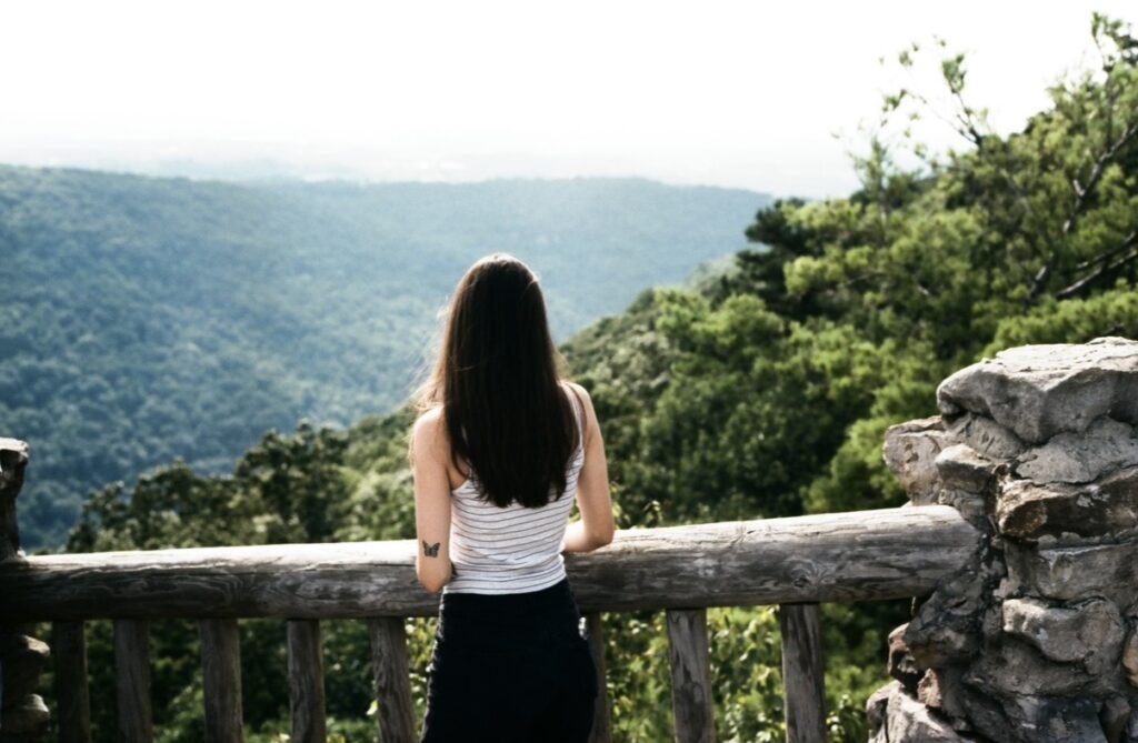
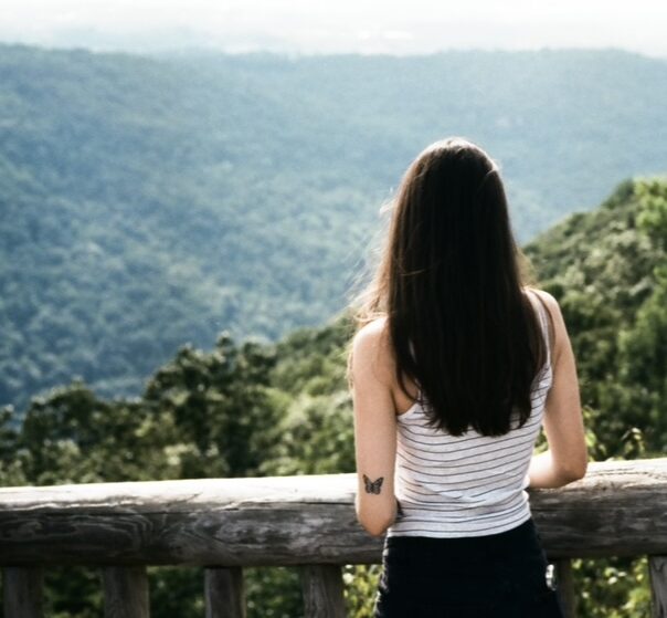
I recently got back my film photos, taken by my boyfriend, so I decided to dig through those for this assignment. We took a camping trip to Cooper’s Rock back in July (a West Virginia state park), and they had a beautiful lookout over the river and mountains. I found this one particular image that I thought could do really well for a state park advertisement. While I still like the wide landscape of the first photo, the second uses composition techniques like the rule of thirds to un-center me, a simplified background, and leaves room for me to look off in the distance. When cropping I was thinking about one of the examples from class where the professor mentioned creating a canvas for text, which is exactly what went through my mind here. In the green space to the left of me, I can easily envision something being said to draw visitors to the park!

Hey Amal, this could’ve been a great image for media lab 4 with the open space and all haha. I think this might have been my favorite set of the class, it could just be my photo background though. In the first image there is way more details and hints as to where you are, in the second that information disappears. I like that aspect of it, it amplifies a sense of mysteriousness and wonder. I like that you chose to stick to the rule of thirds as well by putting yourself off to the right. it matches with the open space and leads the eye out into the distance. one critique, I would add is that the top part still feels a bit blown out in the highlights. I would try to burn in or darken the sky by increasing exposure to that specific area in the printing/editing process. Just to separate the edge of the image from the white of the page a bit better. Or perhaps cropping a bit lower into the tree lines? Great job otherwise!
Thank you for sharing your work with us! I think the original image has a wider sense of awe and a focus on nature, whereas the tightness of the crop makes the image feel more personal and focused on the individual. I think the way you decided to crop this image is the most conventional and makes a lot of sense. Other options could have been to keep the rocky pillar on the right side and shift the individual to a similar position on the left of the image to create two parallel lines, however that kind of crop probably would have needed a bit more space on the right side of the image to be fully effective. I don’t have any good ideas of how to improve this crop, but I see that Kenneth made a couple of suggestions that could be worth checking out/keeping in mind for the future.
Hey Amal, it looks like you got some great photos from your camping trip! You followed the rule of thirds really well with this assignment, and the new cropped image adds ambiguity as to where the photo was taken. I think this makes the photo perfect for placing in a travel brochure or a state park advertisement like you mentioned. I agree with Kenneth’s recommendation to target the exposure on the tops of the trees to make the skyline more visible, but I also like how it almost looks like the sky is fading into the tree tops.