
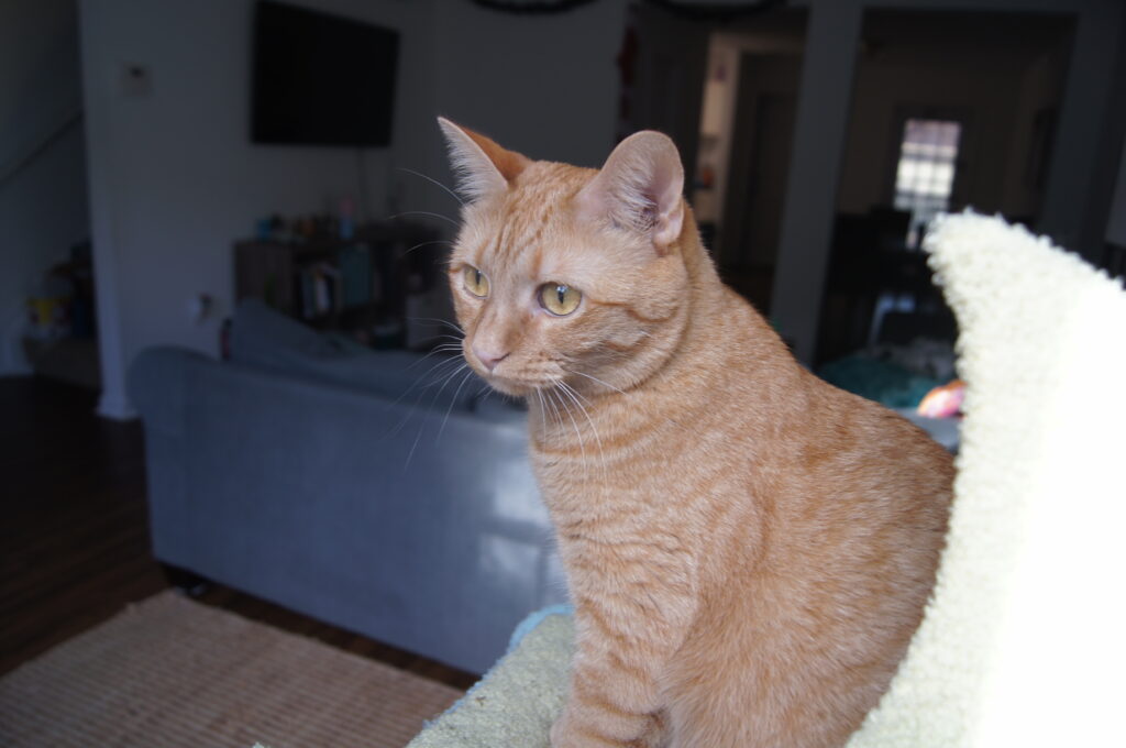
I took this original photo of my gorgeous cat, Honey. While she looks beautiful, the image has a lot of distracting background. You can see my messy living room on one side and the edge of Honey’s cat tree on the other. Additionally, Honey is in almost the dead center of the image.
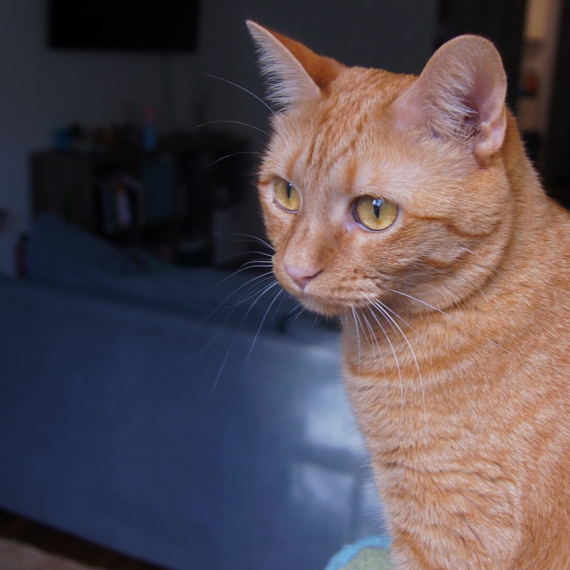
By cropping, I brought Honey’s eyes up to the top third of the image to bring her to eye level. I also removed the unnecessary details. Finally, I also uncentered the subject, and brought Honey a little more to the right to make the image more visually interesting. This makes use of the negative space on the other side of her. It looks like she is intently looking out and this leaves her space to do so and raises the question of what she was looking at.
In addition to the cropping, I turned up the saturation and vibrance to make her beautiful orange pop. I also turned up the shadows a little bit to cast the background into darkness. This focuses the viewer on Honey, as she is the real star of the show.

Hi Olivia,
I love that you used your fur baby as the subject for this assignment! I wish I had thought about doing that. Cats are so photogenic. I am also the proud parent of an orange flavored feline, and I love how you emphasized Honey’s coloring. The way you positioned her makes her look regal and sophisticated, like she was posing for a high fashion photoshoot. Your use of the rule of thirds draws me to focus on Honey’s eyes whereas in the original I’m immediately drawn to her ears. Thank you for sharing 😊
Hi Olivia,
Honey is such a lovely cat! Making her orange color pop was a very good decision, and so was emphasizing the negative space so that she can have somewhere to look. I think it would be possible to crop it even more for a tighter focus on her face (cropping out the bottom third, for instance), but I like what you did. You could also possibly further emphasize the blue of the shadowy background as a complimentary color for orange.
Great work!
Hi, Olivia!
Honey is so dang precious that it’s no wonder you wanted her to be the focus of the image. The cropped version is more striking because my eyes go straight to Honey’s. Her intensity makes me curious as to what has gained her attention. I liked that you left a little more negative space to allow Honey a longer view. Her fur and markings pop in this image and contrast nicely with the blue background. Thank you for sharing!