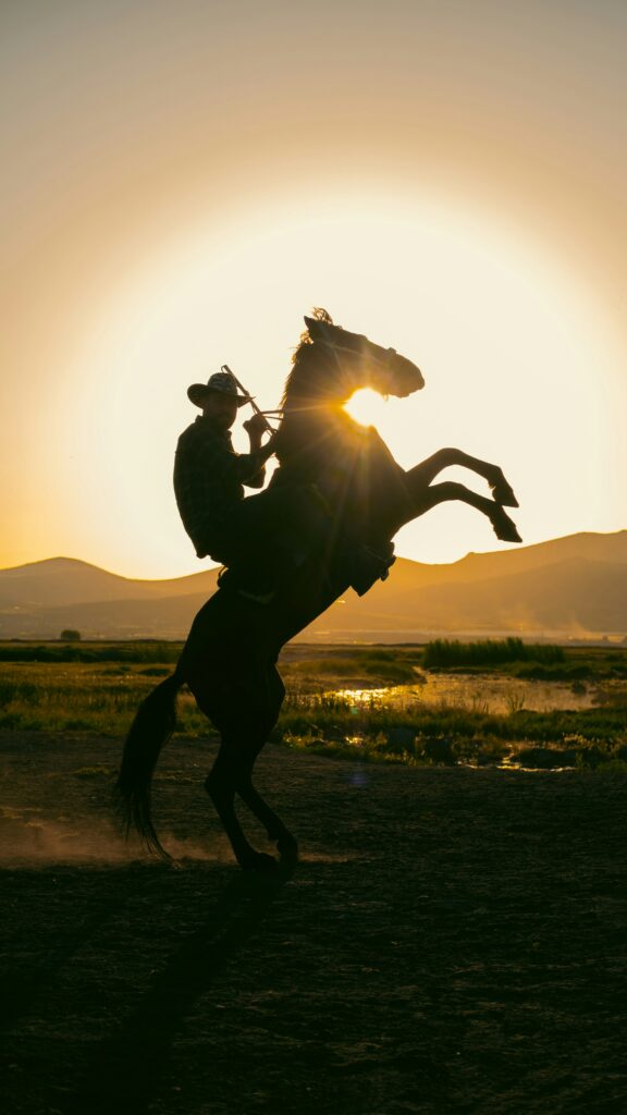
“A Man Riding a Horse in the Middle of a Field” by Cemrecan Yurtman on Unsplash
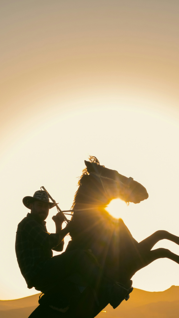
“Riding To Freedom” by Sinbad Adjuik, licensed under CC BY.
For Riding To Freedom, I was presented with a captivating image of a cowboy riding a horse against a breathtaking sunset backdrop. The original composition was a testament to the beauty of nature, yet I saw an opportunity to enhance it by focusing on the horse and rider and simplifying the background.
The original image was quite dynamic, but the subject was lost in the vastness of the background. There was a lot of empty space above the rider, and the horizon line felt too high. The background elements, while beautiful, detracted from the focus of the rider and horse in motion.
By cropping the image, I was able to bring the horse’s action and the rider’s silhouette into sharper focus, while also simplifying the background by removing excess sky. This adjustment allowed the dynamic elements of the image to stand out more, particularly the striking halo effect created by the sun behind the horse.
I also applied the rule of thirds, a fundamental principle in photography and design, to give the composition a more dynamic feel. Instead of centering the subject, I positioned the rider and horse off-center, along the imaginary lines that divide the image into thirds both horizontally and vertically. This technique makes the image more natural and less static, enhancing the overall visual appeal.