 . This work is adapted from “Garden Goddess” (2023) by Amanda Pazos, used under CC BY 4.0 .
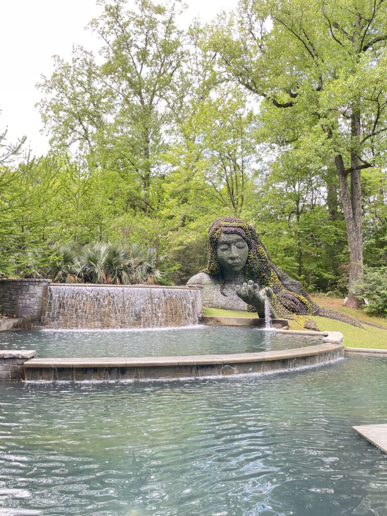
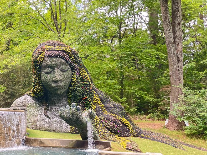
I took this photo at the Atlanta Botanical Garden in Atlanta, GA. The original shot was beautiful, but the statue felt too far away, and the foreground didn’t really add to the story I wanted to tell. While the fountain was a nice element, it competed with the statue for attention, so I decided to remove it.
To fix this, I cropped the image to bring the statue closer and make her the main focal point. This helped highlight the intricate details, like the flowers flowing through her hair. I also removed some extra greenery and the fountain in the foreground to keep the composition clean and direct the viewer’s eye straight to the statue.
When editing, I used Pixlr and selected the Monitor preset while cropping to keep a balanced aspect ratio. I also used the Auto Fix tool to brighten the image, which helped bring out the details in both the sculpture and the surrounding greenery. The small adjustments made the statue feel more vibrant and connected to nature.
I followed the rule of thirds by positioning the Earth Goddess slightly to the left, making sure her full figure was visible while still keeping some of the surrounding greenery. I also used tight framing to eliminate distractions and make the image feel more intimate.
In the end, these edits helped shift the focus back to the Earth Goddess and her connection to the garden, creating a stronger and more visually appealing composition.