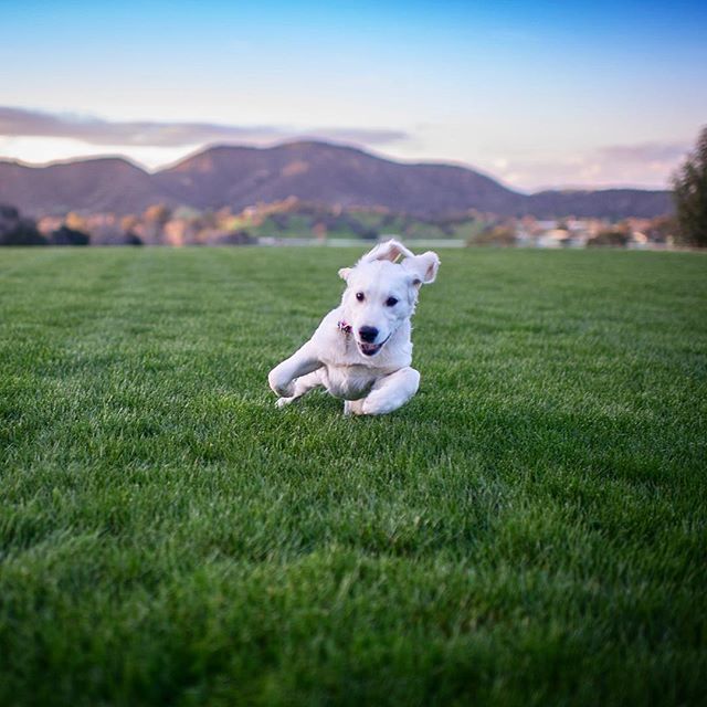
I chose this image (left) from Flickr because I was initially intrigued by the view of the mountains and the nice view of the calm sky as the sun seemed to be setting. While nothing was wrong with the original image, I began to look more at the image because I wanted to see how cropping and reframing the image to focus on the small white dog would change how it made me view the photo. The original image by Alex Beattie illustrates a small white dog running across an open field with a view of the sun setting with distant mountains. The image overall focuses on the view and the calmness of the setting, with the small white dog being an afterthought.
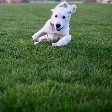
After cropping and reframing the image (right), the focus is automatically put on the dog as the depth of the image changes. By removing the sky and the view of the mountaints, the image is now more focused on the dog’s range of motion, energy, and expression. The dog is now centered, giving the image a feel of the dog running right towards the viewer, as we get to see the joy on the dog’s face. The image now looks as if the dog is in a random yard, playing freely.
The change shows how cropping and reframing can really alter the way an image is perceived. The change of contextual elements changes the original narrative that the original artist wanted us to see. The cropped image encourages the viewer to connect more with the dog, rather than enjoying the calming view of the scenery surrounding it.
Original: “I was taking a photo of the beautiful Santa Monica Mountains ⛰ and wouldn’t you know it… Althea photobombs my landscape photo… oh well 😔 😍🐾💕🐾” by Alex Beattie is licensed under CC BY 2.0.
Derivative: “Zoomies in the Wild: Caught on Camera” by Destiny Rogers, licensed under CC BY-SA 2.0. Cropped from the original.