Jennie Camillo Was Only Eight


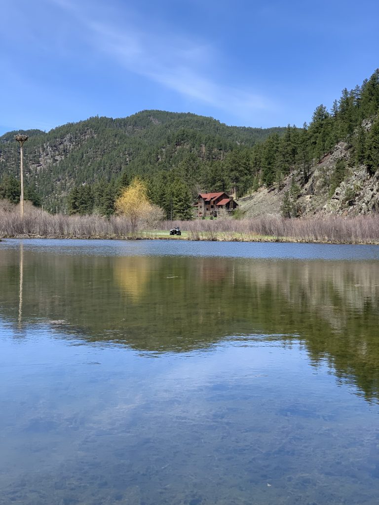
This is my happy place when looking at this picture before cropping the photo. You see everything and there is no focus. You have the sky, the hills, the eagle’s nest, the pond, the house, and the ATV. There is a lot of different things to focus and you can get distracted by many different things going on in the picture.
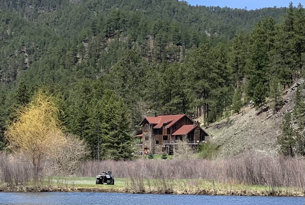
Now with the photo cropped its focus is on the house where I used to sleep after a long day of being out in the middle of nowhere. The ATV took me to all the new and different places. With the photo is cropped you can just focus on two different things the house and the ATV. Having cropped the picture shows a different story. Having the photo cropped I like that the house is more in focus. I learned a lot and did a lot in that house.
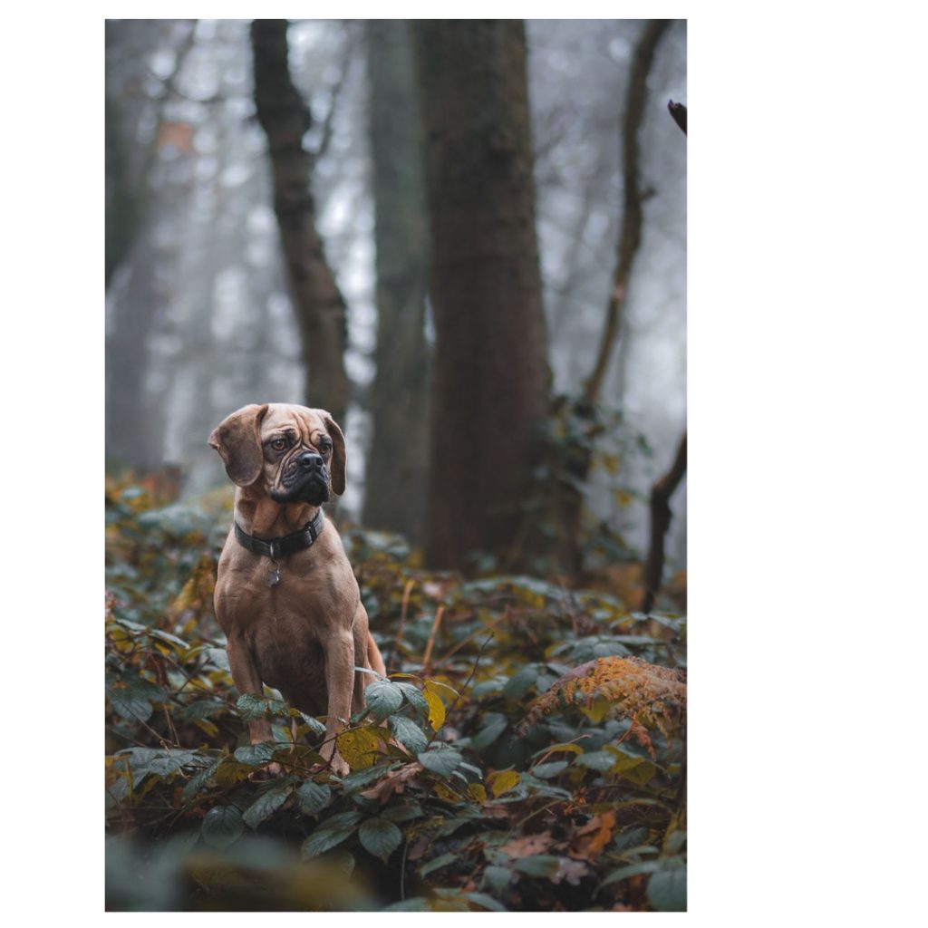
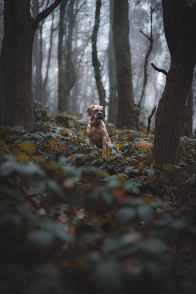
I was drawn to this image of a Boxer in the forest because I thought the setting was peaceful and contemplative. (I also have an affinity for floppy-eared Boxers because we have had several in the family.) Although the original image is impactful – the lighting focuses on the dog and the darker edges give good contrast and a sense of the space around the dog – I felt like it could benefit from some improvements. In the cropped version, I decentered the dog and placed more focus on him rather than the scene around him. It made sense to place him in the left lower quadrant to bring attention to the direction of his gaze. This placement also removed much of the foreground, which simplified the image and brought the dog closer. Although much of the forest is removed, one still gets a sense of the setting.


The top picture is a photo I captured of my son Elijah on portrait mode on my iPhone. He is enjoying tummy time and just really grasping the concept of holding his head up. Because the photo was taken on the bed, it had a lot of extra things on the sides and showed the wrinkles in the cover. I couldn’t really see his face very well so I wanted to fix that as well. Now I’m biased but I think he has the most gorgeous eyes ever and looking at the photo I knew I wanted to zoom in on his face and create some depth there.
With my cropped photo at the bottom, I used the rule of thirds and placed his face at the left intersection. I also used the vignette feature on the iPhone to darken the edges of the photo. to me the dark edges brings my eyes to the center of the photo. I also changed the filter and applied the vivid cool filter on the photo which gives it almost a blue overtone and dims down the light in the photo creating a more softer photo.
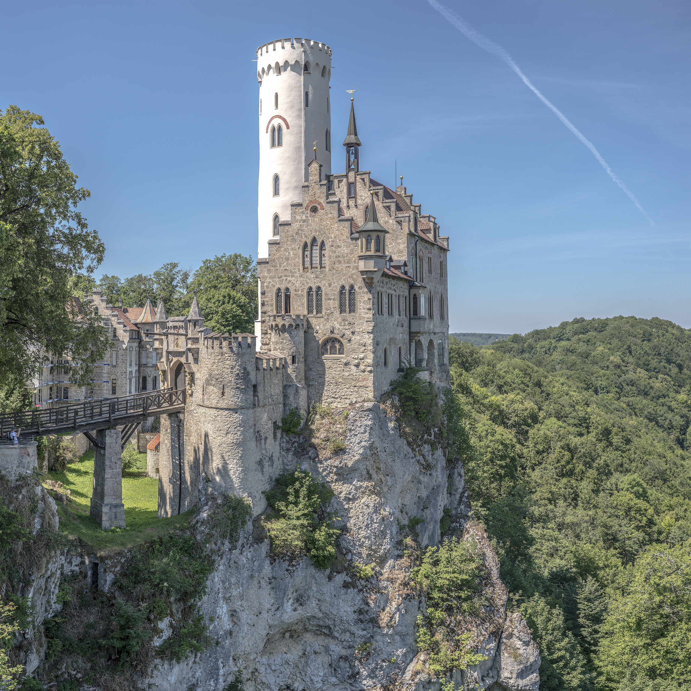
German castles are some of the most unique structures in the world. The ability to carve them into the side of a mountain or bring materials up to a remote mountain peak long before paved roads is certainly impressive. This photo is one example of the engineering feat. Nothing is wrong with the original as I believe the photographer was trying to capture the natural beauty the castle is surrounded by along with demonstrating the shear size of the structure. However, this photo is a lot to process with much detail everywhere. The main structure is centered in the middle of the frame with nothing specific focused on the one third. Also, there is a tourist on the left side of the frame which slightly takes away from the all natural feel.
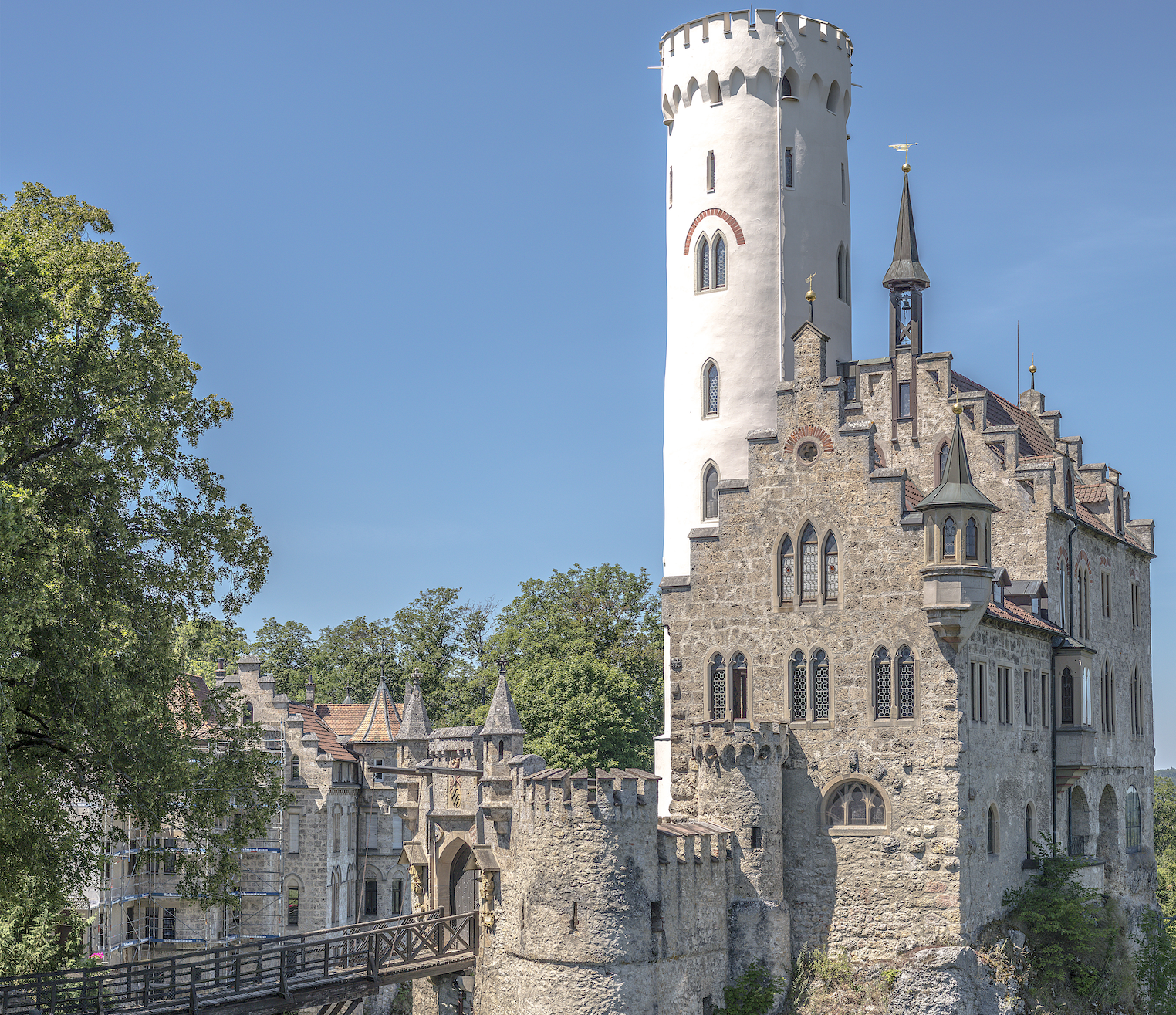
In my crop, I decided to focus in on the details of the main structure, specifically the high contrast, tall, white lookout tower. This allowed my eyes to easily focus on something in the frame and see closer details of all the other structures. To crop this photo, I used the one third rule emphasizing my focal point on the white tower. This uncenters the photo and also simplifies some of the background as my focus was the tower and not the whole castle. Though you lose the mountain top feel, you can more easily see the large door protecting the castle on the bridge along with the ability to raise that bridge for protection. The ability to view these smaller details was the result of a tighter crop and high resolution photo.
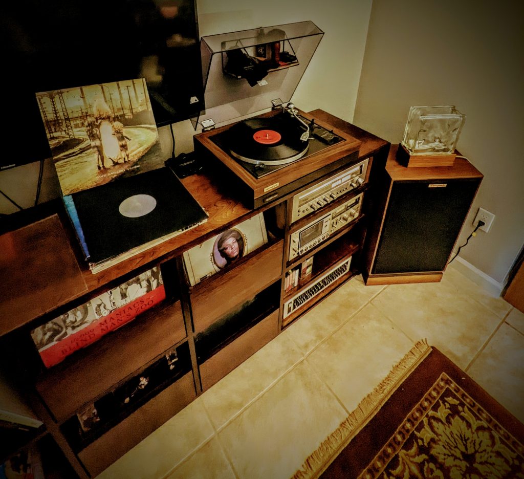
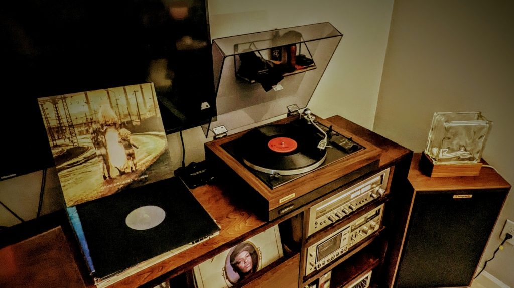
Frustrated Inc. is my photo of a record I just received in the mail this past week or so. The album is Grave Dancers Union by Soul Asylum and is one of the most influential albums of the mid-1990s and a significant influence on me personally.
I took a large image of the stereo area in this set of photos, which had no focus on it. It was just a wide shot of an area of the living room. I focus much more heavily on the second photo by cropping the area around to make the album, turntable, and lamp stick out. The album has more focus, but you are also drawn to the old turntable and vintage lamp. The lamp is turned off. Most would have the lamp turned on, but I titled the photo Frustrated Inc., a song on the album. Frustrated is that there seems to be no light at the end, no way home, yet the record is playing; life is still moving. As someone who struggles with mental health issues, I feel that in the song’s title deeply. I am frequently frustrated and feel there is no light at the end. The light is there; you just can’t see it yet.
Are you familiar with the album and can resonate with any of the feelings of frustration that the album portrays in the many songs about losing hope in tough times?
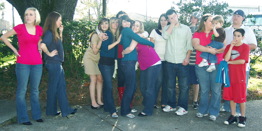
Using Adobe Photoshop, I cropped the photo in order to alter its perspective. Pictures have the ability to tell stories in many different ways. The picture I selected is a great example of how this works. In the original picture, we can observe a large family posing for a picture. However, while some seem interested, others appear distracted.
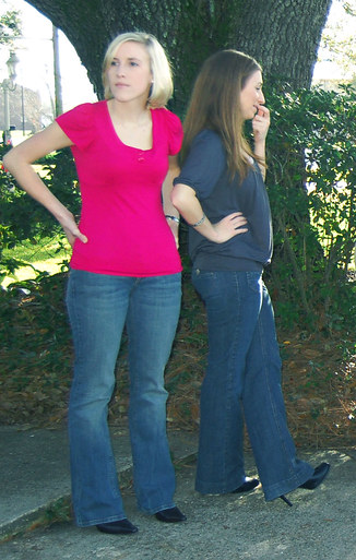
By using the rule of thirds, I cropped most of the people out of this picture, leaving only two people, one of whom is staring into space and the other amused by what is happening in the background. We are left wondering what the ladies are looking at. They are each staring at something different. This is funny because people could actually use the image as a meme.
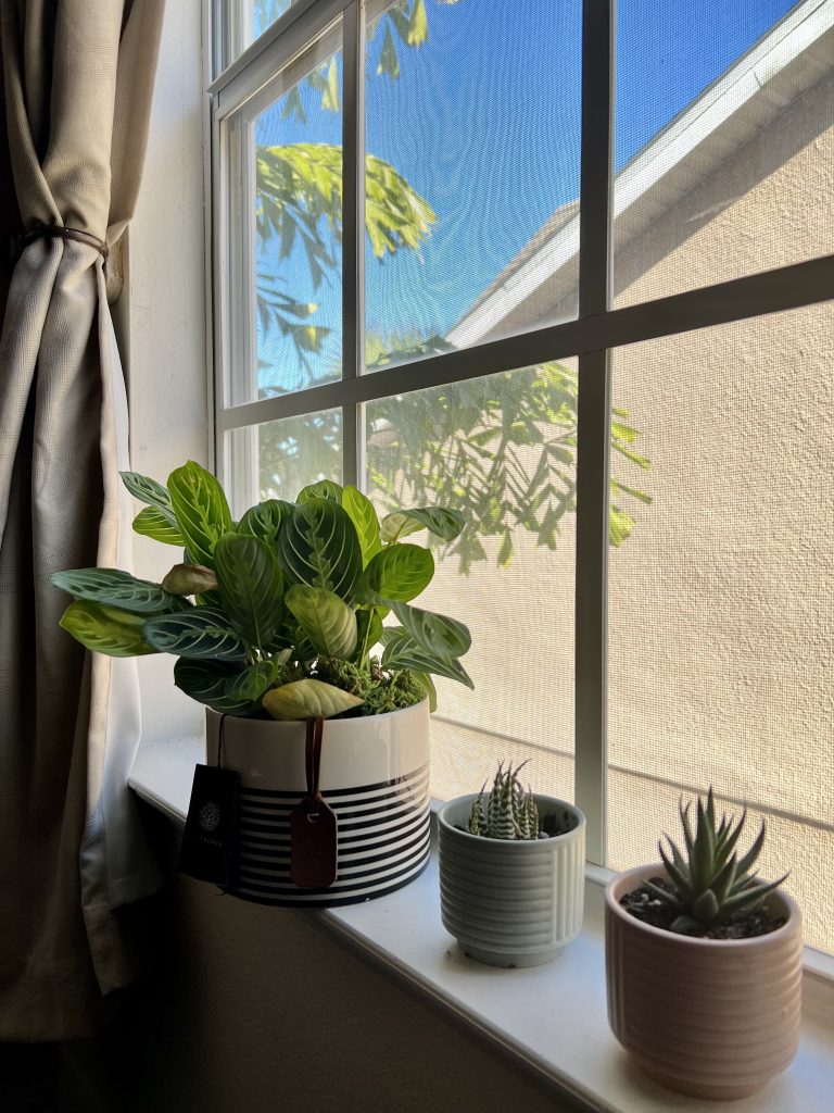
I chose my newest indoor plants in selecting an image for this week’s project. These plants are placed next to my WFM desk. In the original photo (featured above), there are many vivid colors/background noise behind the plants between the sky, outside trees, and windows. I wanted to create a more focused and new narrative by eliminating the plant closest to the viewer. Using the rule of thirds and my grid line, the new image is now centered with the most significant plant located in the top-left grid and the succulent situated at the bottom right of the grid. This creates more focus and light for the two plants and brings the plants closer to the viewer than before. It also enriches the main plant’s color than before. I also like that the plants are neatly lined up and centered in the original. The cropped photo centered the two plants while also cutting off a chunk of the main plant, almost like getting a hair cut! The cropped image simplifies the background more than the original.
And just like that, then it became two plants.