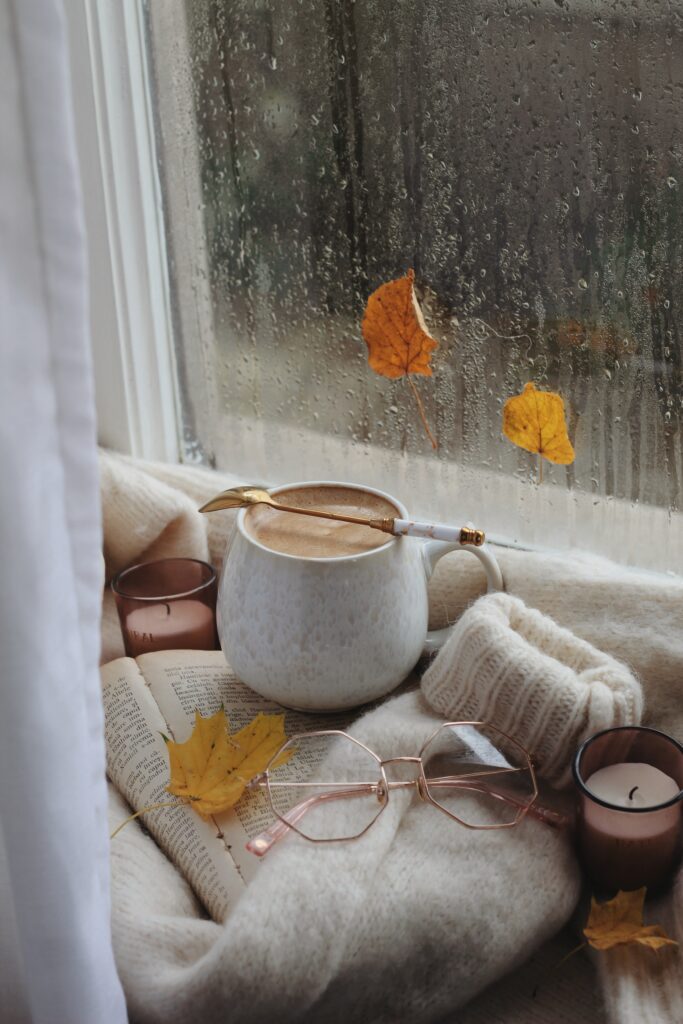
This image popped up in a search for cozy reading and encompasses everything that I envision in a comfy, cozy weekend: a fall, rainy day, snuggled up on the couch with candles burning, a good book, and a relaxing drink. There were several rainy sound choices to choose from by the same creator, TRP. I chose 220822 because the rain was loud enough to be heard on the roof with just a touch of thunder in the background. It sounded like the perfect amount of rain without being an annoying mist or a torrential downpour.
Enchancement
The visual and the audio truly enhance each other by immersing you in the experience. Listening to the rain while viewing the photograph makes you feel like you are really sitting at the window, gazing out at the rain while you take a break from your book. The photograph without the sound is still beautiful, but the beauty is magnified when multiple senses are at work. The audio alone is just listening to a clip of rain, but added on top of the photo, it becomes a close-up of relaxation.
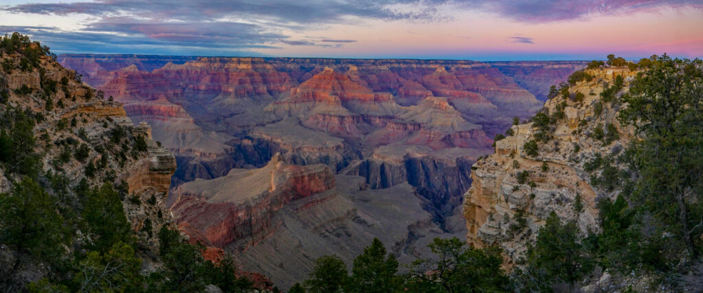
That is what I told myself as I watched a sunset much like the one featured in ‘Grand Canyon National Park, Powell Point Sunset 1310035’ by NPS/M. Quinn and Grand Canyon National Park. It was quiet, except for the sounds of nature; the gust of wind, the echoing of birds, and the occasional crunching of loose rock under our feet. This was all impermanent, just like us.
Last fall, as the seasons were shifting from fall to winter in Grand Canyon National Park, I took one of my last hiking trips before giving birth to my beautiful son. Accompanied by my husband, I remember standing out on the ledge of that enormous gulf thinking that there would never be a time quite like this again. One with the freedom to take off and go whereever we wanted, unencumbered by the responsibilities that parenthood entails. We knew we wanted this new, scary and wondrous change. But it was just that, scary and wonderful. Like gazing down at the depths of the canyon, pondering what new things are to be found around the bend.
The song, ‘Cloudy (Cinematic Lofi Beat)’ by MichaelSchullerMusic, paints a contemplative picture, one that isn’t quite sad or joyful, but reflective of what has been and what will be in the future. The birth of a child is a time to consider who we are as people, and who we want to be for our children. It truly is like standing at the precipice of a canyon, ready to jump into the unknown.
That silence my husband and I shared at the Grand Canyon is now gone. In its place, there are belly giggles, triumphant grunts of success, and a fair share of frustrated cries. Someday the quiet will return, but the adventure we feared would leave us remains as we constantly learn and explore new things about ourselves and our spectacular baby boy.
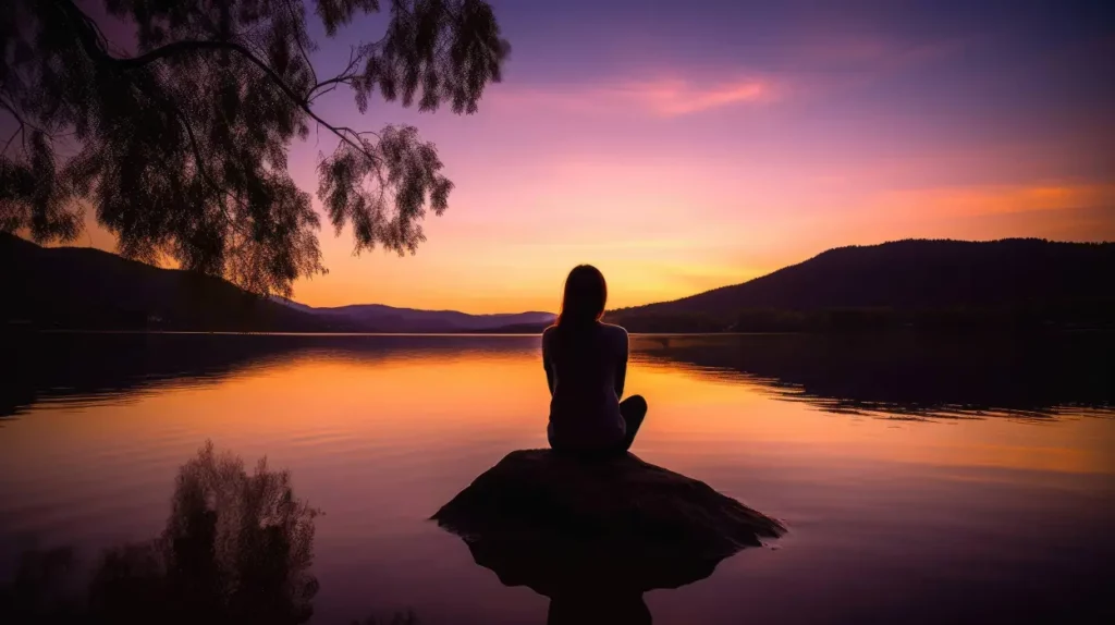
A woman meditating beside a tranquil lake, reflecting the colors of a serene sunset, as the gentle evening light creates a peaceful atmosphere. By Ralph is licensed under CC BY 4.0 DEED
small waves at lake By Garuda 1982 is licensed under CC0 1.0 Deed
For this assignment, I wanted to focus on a peaceful atmosphere created by a sunset. Each day life brings us ups and downs and all sorts of challenges and sometimes we feel like the weight of the world is on our shoulders. The picture by Ralph Ai Artis shows a woman meditating beside a tranquil lake with the sun setting in the background. Sometimes we need to still away to a quiet peaceful place alone and reflect. During this time I think about how thankful I am for life, health, and the challenges I face each day. I am thankful because I know prayer, grace, and mercy are with me and nothing is bigger than my faith. This picture reminds me that although it may seem like I am alone, I am not because someone bigger is always with me.
I picked the gentle sound of waves and water lapping at the shoreline. The sound is calming and soothing and reminds me of an early morning walk along the beach during a summer vacation or an afternoon relaxing on the beach with family. The sound of water is relaxing and puts the mind at peace.
I talked in the first blog about being born in Egypt. Here I’m posting a picture of the Pyramids of Egypt at Giza area. What is it famous and know to people that Egypt has only three Pyramids, but this is not true. Egypt has more than fifty Pyramids, but the famous ones are the Three at Giza area. I also tried to upload an mp3 for techno track I liked, but WP did not allow me to upload it because the audio file was exceeding 10mb, so I had to change it another audio from Soun Cloud. After getting with Dr. Barrager, I was told not to embed anything from Sound Cloud due to the copyright. I uploaded a similar audio that sounds close the original one I wanted it upload.
Have you ever wondered that the night sky is the original state of the universe? The morning sky we see is because of the medium-sized star we revolve around. The universe has been always my favorite thing to learn about. I found Darkriver by Hypatia Alexandria a perfect way to show how beautiful the universe looks like. I have always been a fan of sci-fi movies so I was searching for a soundtrack that could fit in to show how intense the universe is. The Jet Fueled Vixen by Kevin MacLeod soundtrack blends completely with the picture. The deep bass in the soundtrack makes you feel like you are an astronaut in a spaceship looking out of the window and seeing the ocean of stars. That’s the reason I believe this soundtrack goes well with the picture.
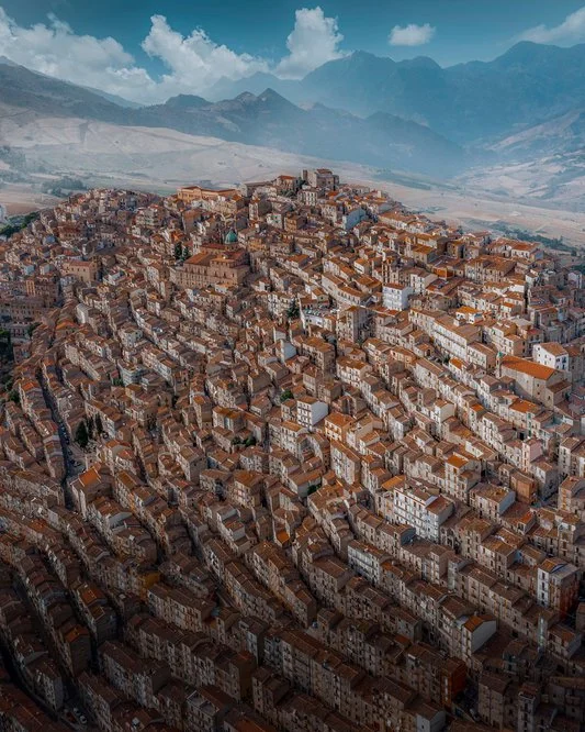
For this assignment, I found this photo by Sarah Zanini so striking and almost aesthetically pleasing, I had to share. This is a picture of Gangi, Sicily. The way this city is formed, with houses and buildings built one on top of the other, looking like a mountain. The aerial view looks almost like a mozaic, I love how no building is shaped the same. It looks intentionally imperfect, and I love how the mountains on the top capture what’s outside of the hilltop. Most cities are built outwards, and I love how it’s built upwards but not industrial. The historic hilltop looks like it still preserves this historical element to the city.
I paired this photo with Agnus Dei, a religious Latin chant. This particular copy is from Michał Ziółkowski. I thought it was very fitting with the history of Gangi. A Latin chant to show how Sicily’s culture and history of being primarily Roman Catholic. The architecture reminded me of this chant, and I think the two fit together. The audio is almost eerie and enchanting as well, which is what I immediately thought of the photo when I saw it.
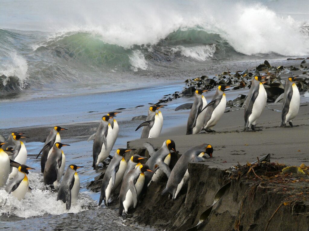
For this assignment, I wanted to combine image and sound in a referential way, but also to tell a new story. At first, I wanted to find an unsettling photo and pair it with some kind of spooky music, but that still felt a little too on the nose. My next thought was to pair some kind of nature imagery with human sounds (for example, a flock of flamingos and crowd noises). I decided to combine an image of penguins and the sounds of marching footsteps. It would be a bit of a spoof on the March of the Penguins documentary from about two decades ago.
As penguins typically waddle to their destinations, I found the mental imagery of penguin soldiers to be quite humorous. As I thought about the idea, I began to imagine what these penguins would be fighting for. Enraged by the activities of the human population, this Antarctic army would rise up to stop humans from contributing to climate change. Here, you can see the “invasion” pictured. The image itself reminded me of historical imagery of D-day and the soldiers storming the beaches of Normandy. By pairing it with this audio, you too can imagine the penguins charging into battle.
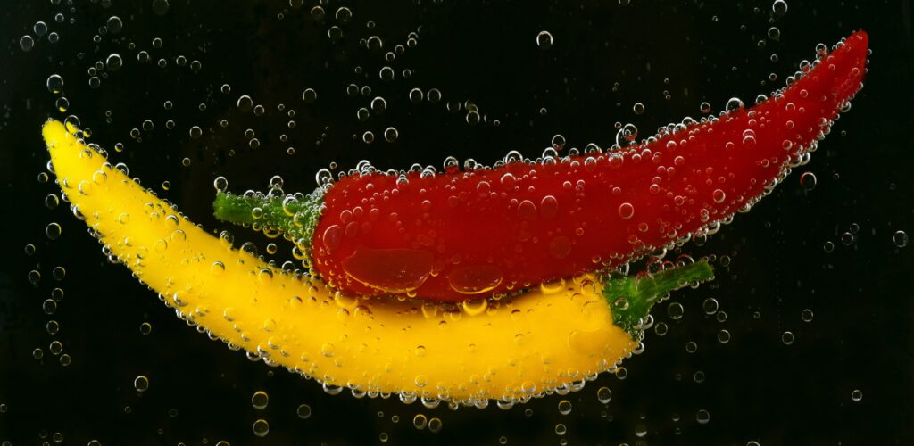
Food is an easy way to get to know others. For this week’s assignment, I wanted to combine two things I love: peppers and the sound they make when hitting a hot pan.
In my family, peppers are critical. My father grows his own hot peppers – and shares as many as he eats – and my mother-in-law is Korean, so most everything she cooks involves some kind of pepper (typically involving gochujang, a red pepper paste popular in many Korean dishes).
I liked the image because I could already hear it in my head, even though it is water (instead of oil droplets). When combined with the sizzling sound, it transforms into a combination that makes me hungry!
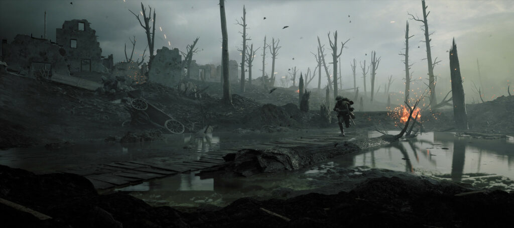
TWs: explicit content, trauma, violence and death, war tactics, and graphic content.
I have a particular interest in World War I. Even though I am an historian of African history, World War I is one of my other historical interests. Did you know that five million horses died during World War I? Machine guns were strapped to the back of horses before tanks were invented. World War I was a social, political, and technological turning point for the entire world.
This image is a recreation of the Battle of Passchendaele, also called the Third Battle of Ypres, that occurred in 1917 during World War I. This was one of the most horrific battles of the First World War, with Flanders getting record amounts of rain that year, turning the battlefield into toxic mud-filled shell holes.
I paired this image with a powerful song from 2Pac. He started this song with a Shakespeare quote about cowards and soldiers. In this song, Tupac rapped about the senseless violence he experienced. He recognized that his life was fragile, and accepting death was a harsh necessity in his life. He wondered what heaven would be like, as a person who lived the “thug life”.
The themes in this song of senseless violence, the fragility of life, living with so much death, and the feeling that you’ve done wrong mirror experiences felt by soldiers in WWI, particularly those that fought on the front lines. In some areas of the front, soldiers were constantly barraged for months at a time. Soldiers at Passchendaele dealt with not only illness-inducing conditions, but also artillery shelling, poison gas, and mud that drowned and killed their friends. Tupac’s songs illustrate how he practically lived in a war zone; the soldiers at Passchendale in 1917 did, too. The meaning of the song, as well as the meaning of the image, have been both slightly augmented and enhanced.
One soldier that lived through the Battle of Passchendaele wrote poems about his experience. The way humans deal with trauma through art is timeless and universal.
Glastonbury Tor by CyclicalCore CC-BY-SA (https://creativecommons.org/licenses/by-sa/3.0/)
“Waltz Primordial ” Kevin MacLeod (incompetech.com) Licensed under Creative Commons: By Attribution 4.0 License http://creativecommons.org/licenses/by/4.0/
When I was in college as an undergrad, I spent a semester in London. During that time, I did some research into the King Arthur legends and became kind of obsessed with them. I was lucky enough to get to visit and explore some Arthurian sites in the U.K., including Glastonbury Tor. The hill itself (the tor) is rumored to be the mythical site of Avalon, while the tall tower is the ruin of an old church that used to stand atop the hill.
For some reason, Glastonbury really spoke to me in a way that I haven’t experienced anyplace else. I felt at peace and like I was meant to be there. It’s hard to explain but even all these years later, I remember this trip with such fondness. It was a moment in time I will treasure always. I even have a tattoo of the wrought-iron design that decorates the Chalice Well, another sacred site in Glastonbury (the Grail was supposedly hidden there).
Music has a way of weaving itself into my memories. During my road trip to Glastonbury with my professor and housemates, I was listening to a lot of acoustic and alternative rock on my Walkman — this was 1994! I remember listening extensively to Stone Temple Pilots, and even saw them in a small club in London. This audio clip I found has a similar sound and feel that brings me back to that time.


