
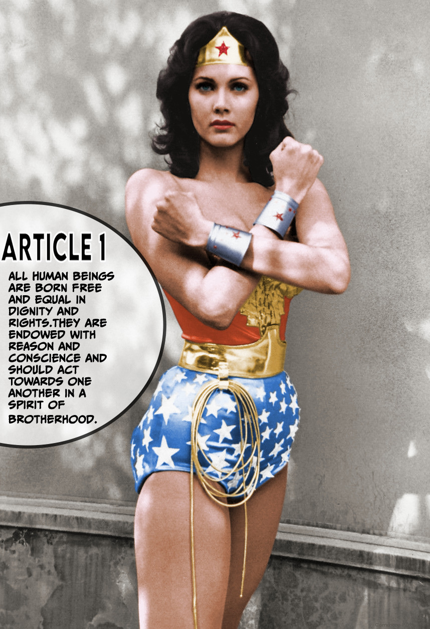
“Wonder Woman’s Stance” by Katie Kimberly is licensed under CC BY 4.0. This work is derivative of “Lynda Carter Wonder Woman” by ABC Television which is in the public domain with modifications by Alex Jazz. This image is apart of the public domain (PDM 1.0). Downloaded from WikiMedia Commons on 02/11/2025.
“Article 1” is from the Universal Declaration of Human Rights
Edited in Adobe Photoshop CC 2025
Fonts: CCMeanwhile (Available through the Adobe CC Font Portal) and a San Serif font provided in Adobe Photoshop.
Important to note: There are many different versions which can be seen in the list below the image on WikiMedia Commons. Alex Jazz, modified the photo by colorizing the black and white version.

I really like the font choice and how they used the shape with a border to put the text on top. It really fits the Wonder Woman image, kind of like comic book text. I really liked how well the text went with the image, but there needs to be more contrast between the main text and the header text, since the header font looks too much like the body text. I do think that it goes well with the image and the overall message, though. Honestly, I like it just how it is too, but maybe a more comic-book-like bubble letter font for the header text could also go well with the image.
Hi Katie. Great choice combination on Article 1 and using Linda Carter’s iconic Wonder Woman to supplement the article. This reminds me very much of the Rosie the Riveter ad from World War II. The white border color on the Article 1 font header accentuates its appearance and differentiates it slightly from the statement body font. Maybe choosing another header font would make the header stand out more instead of using the white border on the font. The negative space to Wonder Woman’s left arm could also possibly be cropped out along with the bottom 4th of the picture. This would allow you to play more with the rule of thirds and align her head to the top right focal point. You could also slide the circle down a tad so that both her arm and backside can have equal negative space separating them from the text. Overall, you did a great job and I love your choice of combination.
Hi Katie! I am obsessed with your interpretation of Article 1 and the inclusion of graphic novel-like elements. I believe both fonts compliment each other well, and stay true to the intended theme. The selection of Wonder Woman, as well as the chosen font type, embodies the symbolism of “freedom” and “brotherhood”–or perhaps in this case, sisterhood (if we’re taking an additional feminine twist). While I don’t have many suggestions for improvement, one that I can offer is to make the Article 1 title a different font color. Perhaps use the eye dropper tool to pull from Wonder Woman’s outfit? I think adding in another pop of color will provide additional contrast to the overall image and provide additional context emphasis. Great work!