
I began this assignment prompt by searching through my personal albums, Pexels, Flickr, and through digital collections at the Library of Congress. Many collections caught my eye, but ultimately I really enjoyed searching through the William P. Gottlieb Collection that contains images documenting the jazz scene in New York City and Washington, D.C., from 1938 to 1948.
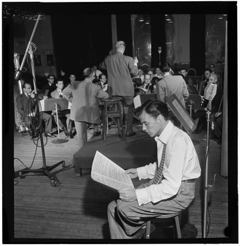
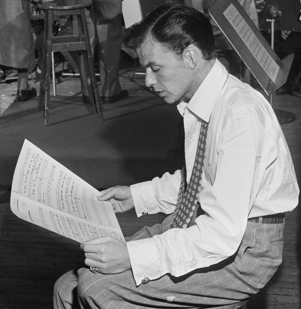
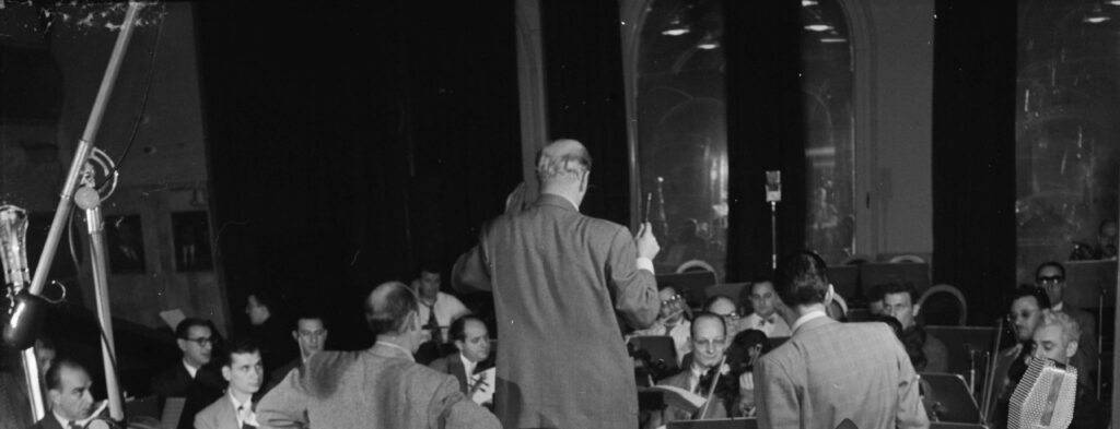
After cropping many photographs from this collection, I chose to highlight the above image of Frank Sinatra and Axel Stordahl at Liederkrantz Hall in New York, circa 1947. The original image is very busy, with Frank Sinatra in the foreground in the right-hand corner and the large orchestra in the background. I decided to crop the group of men in the background out using the 1:1 square preset and make Frank Sinatra the focal point, plus keeping him slightly off center to follow the rule of thirds. I also tried a similiar method after, instead cropping out Frank Sinatra and making the focal point the orchestra, but didn’t like the outcome as much because, for me, it’s too dark and has too much negative space (included below as well).

Hey Emily,
I enjoyed looking at your post. Your image choice was unique and interesting. I agree with you that the original image was very busy, and your choice of cropping it 1:1 on Frank Sinatra was excellent! You do a great job of isolating the subject, Frank Sinatra, and using the rule of thirds to position him in the image. Your cropping of the image has a dramatic effect on the meaning of the image. In the new image, we only see Frank Sinatra, highlighting him as the subject and focusing on what he is doing at that moment. In the original, we see Frank but also the orchestra practicing, highlighting all of them as musicians. I think your first choice of cropping was better than when you tried doing the orchestra. While the orchestra is also an interesting crop, some things that could have improved the image were making Stordahl the focal point of the image, using the rule of thirds on him, and cropping out some of the men to simplify the picture. Great job!
Hi Emily!
You truly did an amazing job shifting the perspectives from the original photo. You have a great eye, by the way. I love the original photo because it tells so many stories from three different perspectives: the band director gauging his students, Frank Sinatra rereading his sheet music, and the students showing an attentive attitude, ready to practice the music they are being taught. However, I also strongly agree with your original statement about keeping the focus on Frank Sinatra rather than trying to gauge the conductor and his students. It would have been challenging to shift the perspective without awkwardly cutting out any necessary components of the photo. Your work beautifully captures the essence of the moment, and your decision to focus on Frank Sinatra enhances the storytelling aspect of the image. Great job!
Hi Emily,
I’m glad you chose this photo! I actually made a jazz-themed post for our last Media Lab assignment. Though Sinatra himself is off-center, and right on the two-thirds intersection, I wonder how the photo would look if you considered the whole “object” to be Sinatra as well as the sheet music, so that his hands would be right around the two-thirds line, leaving a small bit of negative space on the left. I do agree with your decision to crop out the other faces in the picture, it’s funny that the original title is “Portrait of Frank Sinatra and Alex Stordahl” when you can only see one face (which, to me, defines a portrait). I actually really liked the third image! The “sea of people” evokes a lot of anxious or eager energy to me, just as you might see at a live orchestra, though I do agree with you that there is just a bit too much negative space coming even into the bottom third of the photo.