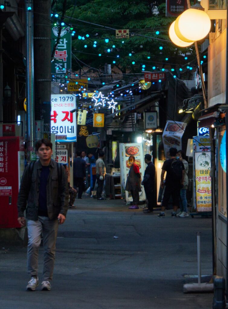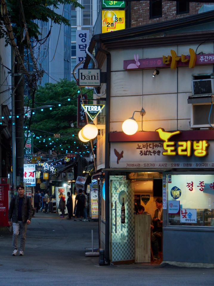

When scrolling through public domain images on Flickr, this street scene caught my eye. The original photo (right) shows several people milling about in a street in Seoul at dusk. The streetlights and neon signs are coming on, but you can still see the remnants of daylight on the office building near the top of the photo. There’s a liminal quality to the original image that I really enjoy. However, I thought there was also an interesting story being told in the lower left that is lost in the large scale of the original.
The cropped version of the photo (left) shifts the focus of the image from the wider street scene to the man walking toward the camera. He’s wearing a backpack, where is he going? The street vendor in the red shirt is watching him, did he just leave the food stall? The original image (right) has a story to tell about the city shifting from day into night, while the cropped photo (left) feels more intimate and focused on the people in the image and their stories. When cropping the photo I did my best to follow the rule of thirds, while still maintaining space around the man in the foreground, giving him room to “move”.


Hi Leslie,
You had a similar issue to me when I was posting my blog post. When I put the images side by side the caption blurred out the bottom half of the images. I couldn’t figure out how to fix it, so I ended up posting the images beneath each other as the blurred bottom cut off too much of my images. I have seen other people who have managed to post the images side by side, so I am realizing I need to check out the Peer Support Discussion Board to see if anyone has a solution or post a question as it would helpful to know how to resolve this issue. Have you asked about this issue on the discussion board?
From what I can of the two images, I think your crop helps to focus in on the street in very different manner than the original. While your crop helps to draw attention to the man, it also helps the other businesses that line the street to stand out. In the original image, I find that I focus solely on the first business on the right of the image and not the street and any of those businesses on the left side. However, your crop completely changes my focus, highlighting this man and the other businesses lining the street.
It might be helpful to provide a link for the public domain license as well as a link to the original creator. However, this may be due to the formatting of the caption.
Great job!
Hi Leslie! Your image choice is super cool. The cropped image really highlights the people in the crowd and gives them character. I also think the lights are highlighted way better in the cropped image. It appears that you had some technical issues with placing the images side by side. They are appearing half blurred on my end, which initially had me quite confused when trying to figure out which was the original image. Your captions are also showing up on top of the image rather than below. I posted in the peer support group how I was able to place my images side by side by using the columns tool.