
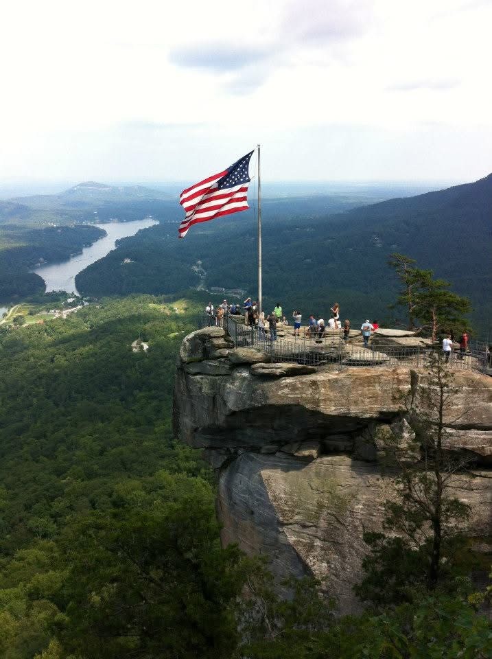
“Visitors at the Park” by Michelle L Taylor is licensed under CC BY-NC-ND.
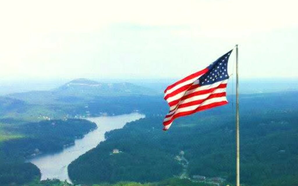
“Beautiful American Flag” by Michelle L Taylor is licensed under CC BY-NC-ND.
This photo was taken during a visit to Devil’s Head at Lake Lure, North Carolina, roughly fifteen years ago. The original image featured the American flag prominently centered, surrounded by other visitors. While scenic, the composition felt unbalanced, with the right side appearing cluttered. To improve the image, I cropped it to showcase the stunning backdrop of Lake Lure. I also removed the congested area with visitors, allowing the flag to take center stage as it gracefully waves in the wind. To enhance the visual impact, I increased the vibrancy and saturation. This cropping technique effectively re-centered the focus, emphasizing the flag while eliminating unnecessary distractions.

Hi Michelle,
Through cropping, you changed the focal point and context of the image quite drastically. In the original, my eye is primarily drawn to the rock formation as its desaturated earth-tone color stands out from the background of green. While the flag is a bright piece of imagery in this version, it doesn’t stand out, likely because of how ubiquitous images of the American flag are. My eyes naturally move over that detail, instead focusing more on the group of figures atop the rock. In your post, you suggest that the original image is lacking balance, but I still think it is an interesting composition, for what it’s worth.
In your new image, the rock and figures have been removed, revealing the flag as the sole piece of foregrounded imagery. Partially due to the crop, but more likely stemming from the other modifications you made, including contrast, I take particular note of the movement of the flag and the shadows cast by its creases. I like the way the river in the background leads the eye across the image, and the slight loss of quality creates a compelling abstract gradient in the sky.
I wonder how the image might change if you focused instead on the group of figures standing on top of the rock. The original image has a diorama-like quality which might be reduced if the figures are made larger.
Before reading your post closely, I was concerned to see the CC-BY-ND license on the original image, since this license doesn’t allow for distribution of derivatives. Seeing that you’re the original author of the image, however, you’re in the clear!
Nice work.
Hi Michelle! I love the photo that you picked for this assignment and think that the cropped version highlights the beauty and emphasis of the American flag. I have been to a similar lookout point called Bell Mountain in Hiawassee, Georgia and it was stunning! In the original image, the visitors, while all unique in their ways, can distract the viewer from the beauty of the nature surrounding them. I always think about how I have been in the background of so many different people’s photos and this made me think of that. I loved that you chose to focus on American pride, while not losing sight of the landscape’s natural beauty. You could’ve picked to crop it to focus on any of the people, the rock structure, or the river in the background, but I think you made a good choice focusing on the flag. The only suggestion that I have is that the slight loss of quality does make the picture grainy. Although this is hard to avoid, zooming out could’ve reduced the blurriness. Great job!
Hi Michelle,
I love the original photo. However, I agree with Craig on maybe keeping some mountain or rock in the image. The cropped image is a little grainy which does affect the image quality. With that, I appreciate the meaning and the message that you are conveying with your cropped image though with putting emphasis on the flag and the nature surrounding it. Great use of the rule of thirds in this image with the perspective being focused more on the flag by cropping. Overall, great photo choice.
Now I want to go visit this landmark!