

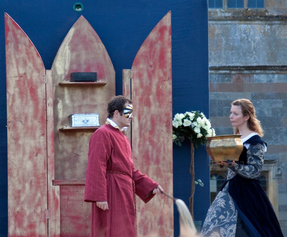
“Shakespeare at Coughton Court 2” by Tony Hisgett is licensed under CC BY 2.0 Deed
I discovered this image on a journey that started with concerts and the idea of zooming in on a well-focused individual in a band or even in the entourage or crowd. I filtered by size and copyright leniency in order to make the search easier, but so many of them were still blurry (or large, but not large enough to be large and usable after a substantial crop). Many times, it was the fog machine’s fault, not the photographer’s. Then I decided to try theaters and plays! These results had a tendency to be much more in focus than results in music venues. This particular play is of The Merchant of Venice. To me, this picture has vibes reminiscent of folk horror (much unlike The Merchant of Venice), and folk horror is a subgenre I’ve always enjoyed. The artwork of the backdrop is simple, almost innocent, and it’s juxtaposed with an eerie figure in a red robe. It reminds me of mythological tales of transcending boundaries, such as the tale of Persephone and Hades.
“Shift in Genre” by Paul Griffith is licensed under CC BY 2.0 Deed
In cropping, I attempted to isolate the theatrical backdrop of the cloaked individual’s setting and contrast it with the entirely urban background of the woman carrying the gilded vessel. In the full image, the viewer sees immediately that this is a performance on the street, with the third player’s playful mood even contrasting from the serious demeanor of the two cropped players. I was undecided about including or omitting the plant on the left, for symmetry, but this would have turned the rule of thirds into a rule of one quarter. Omitting the plant and cropping the image neatly on the cabinet door brings the focus down to the most necessary parts, the individuals representing their two worlds.

Hi Paul,
From a charming scene of Shakespeare in the courtyard to a frame of unsettling folk horror, your crop has changed the story dramatically. Your crop does tell a much better story after cutting a lot of the background and the third player out. After a quick search to refresh myself on the definition of folk horror, I do see the elements of that genre at play in the scene. While her dress is not modern by any means, it does establish a certain era of time that the play takes place in. However, his robes and mask would suggest that he is a member of a secret society or elite group above the aristocracy. She meets his gaze and is not frightened by his appearance. I would have cropped this a bit closer to them to really emphasize their eyes meeting each other’s. The partition behind the man is kind of distracting and by zooming in on the pair, it would register more flatly.
Hey Paul!
This is a very interesting choice for the assignment; I never would have thought to use a photo of a stage, but it gives you some really cool things to play with.
The original photo is broken up into several different sections, which made it difficult for my eyes to decide where to begin. I eventually found myself drawn to the rows of tall, thin windows at the top; these seem to contrast with the lower half of the photo, which takes on the width of the stage and the (similar) height of the players. Meanwhile, the boxy set seems to break these two “worlds” in two. It’s a lot to look at, for sure.
I think it was a good decision to crop it down to just those two characters. I agree that it makes them more of a focal point and juxtaposes their attire and expressions. However, I agree with Christopher about cropping it so the subjects were more at eye level—right now, there is quite a bit of space above their heads that draws the eyes upward.
I would also maybe have cut more off the left, putting the subjects on the two sides of the photo/grid. This could give the photo a sense of symmetry that further highlights the differences in these two subjects.
I enjoyed reading through your process here, Paul. It took me a second to see the two separately, but after understanding what you were aiming to accomplish with the crop, it began to take shape for me. The third individual pictured out to the right would have detracted from your expressed goal of showcasing a slight nuance and juxtaposition. Ultimately, I think the crop was successful for your intended purpose, and I think you made the right choice by opting to forgo including the second plant to the left within your crop. Great work!