
In September 2023, my wife and I visited Seattle, WA. We spent a week downtown, mostly walking around and breathing in that fantastic Pacific Northwest air. The weather was perfect (despite the city’s rainy reputation), and we had a good enough time that we are considering moving there one day.
I grew up in rural Alabama so any visit to a “big city” is an adventure for me. I also work at the Florida Department of Transportation where engineering and construction are common conversations. Walking around any major city, it is nearly impossible not to find a few construction projects or the interesting exchange of urban transportation – in this case, a combination of light rail and an ole fashion intersection:
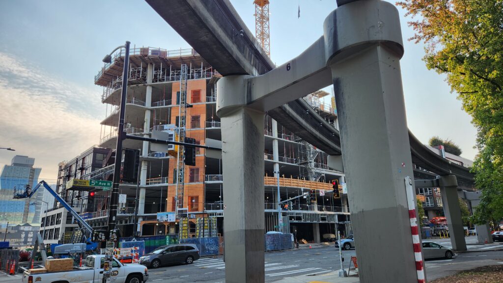
This photo was taken not far from the Museum of Pop Culture. I took it because I liked the lighting of the sky, the mix of colors, and the juxtaposition of the light rail in front with the new construction behind it. Where I am from, only the courthouse is anywhere near this tall, and there aren’t buses, let alone a railway. Cities always surprise me with their ability to change and transform so rapidly while being modern in other ways.
Not everyone sees this picture that way though. For a few people who saw my trip’s photo album, this one was just one bland structure in front of an unfinished one. Here is how I re-contextualized it:
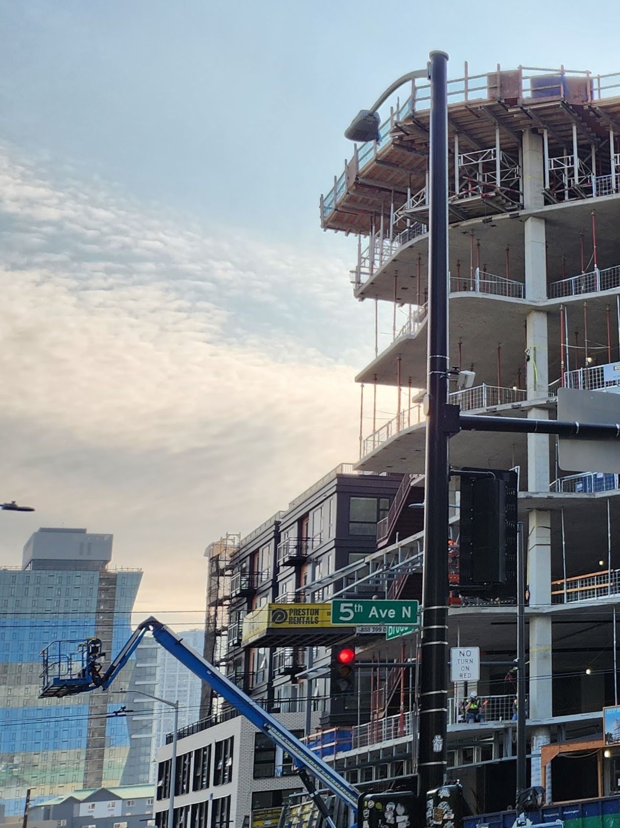
Instead of the competition of the light rail in the foreground and the construction in the background, I chose to zoom and crop along the left-side of the photo, and change the aspect ratio. My hope was to draw the viewer’s eye up, ultimately to the sky, and create a sense of hope and optimism toward this new building.
I also cropped out the street level to further disconnect the image from its original grounding (though I made sure the street sign was closer to the lower-third to still provide some grounding), and straightened the image along the light pole to add an additional sense of rigidity. This also helped in cutting down the overall noise of the picture since a significant amount of the image is empty sky.
As a bonus, this helped bring out the strangeness of the building in the far background. In the original image, it is hard to notice, but in the edited image, its strange curves and multiple colors convey a certain surrealism that I find compelling to the more prominent building mid-construction.

Christopher, I love how your cropped photo uses leading lines – the signpost mimics the upright lines of the building on the right. In addition, there are horizontal lines in the street sign and in the building that create a cool, grid-like effect. I also like the way your composition uses the rule of thirds to divide up the canvas. My only suggestion would be to pick a more obvious focal point – my eye goes to the street sign/red light as the focal point, and you mentioned in your post you wanted viewers to focus on the sky. Thanks for sharing!
Hey Christopher,
This was a really cool take on the assignment. I don’t typically pay attention to construction zones, let alone use them as the subject of a photo, so this was interesting to dive into. I see how your cropped photo enhances the light from the sky and how the colors on the abstract building in the back of the landscape are heightened. After your explanation, I can visualize what you were trying to do. However, when I first looked at your original versus your cropped, I thought it was a story about the actual street name of “5th Ave” and assumed you were paying homage to the famous street of New York. Like Cristina, I struggled to have my eyes go to the sky. I too focused on the street sign, after of course tracking the light pole down the blog as I scrolled. My only real comment for suggestion would be to put the images next to one another next time – with the separation and the text, it was difficult for me to see the changes without scrolling back up/down to look at the other photo. Overall, great job and thanks for sharing!
Hi Christopher! Excellent job on this Media Lab. The before and after of your photos are really dramatic. I had to scroll back to really understand how the photo was cropped because it felt like 2 different photos. Because of the way you cropped your photo, my eye was drawn up and I had a much clearer understanding of what I was looking at. As you said in your post, the cropping allowed the viewer to look at the sky and feel a sense of hope or new beginnings. Specifically, I think the placement of the street sign made a very impactful difference for the viewer. Although the cropped version of the photo is less of the photo, I saw more. Great job!
Hey Christopher! I like how you cropped the image and brought the building at the back which was out of focus into the focus of the image. The first thing I saw when I looked at the picture before was the two beams in front. Cropping out the cars and streets changes the outlook of the image from being chaotic to orderly.