

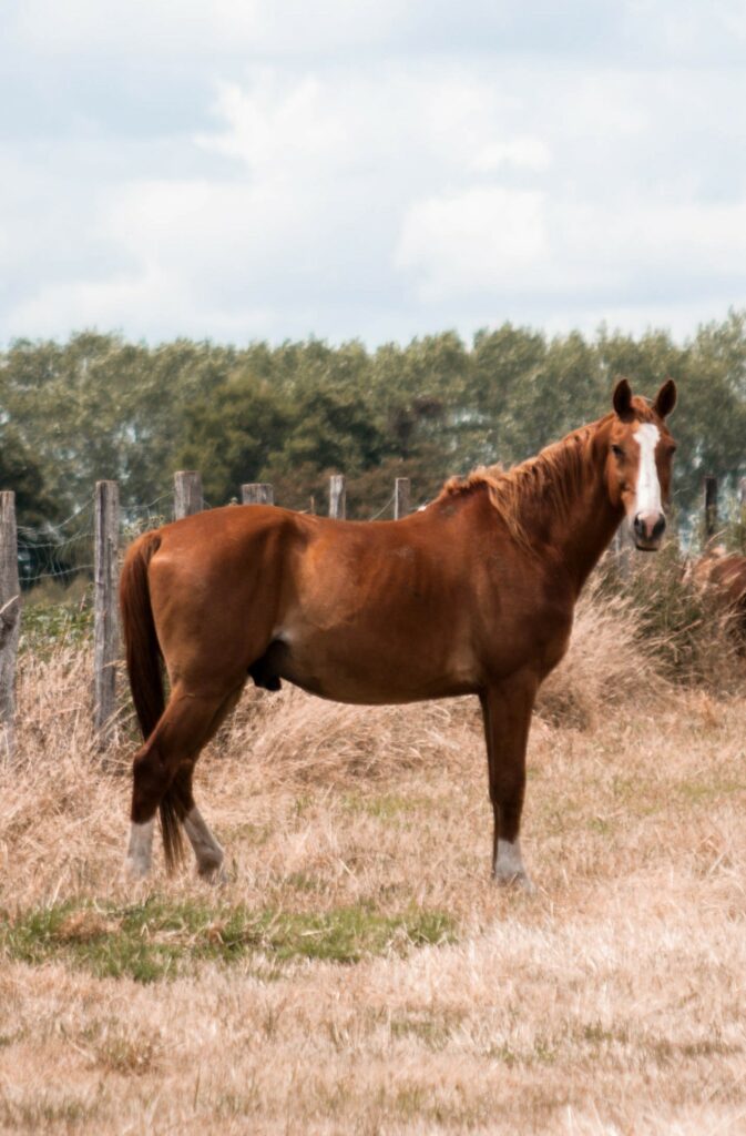
The image above to the left, although lovely, centers the horse in the image rather than positioning the subject on one of the intersection points from the Rule of Thirds, and has some distracting background elements, including two other horses just to the right of the subject. In order to get the photo to format nicely in WordPress, I chose to stick close to the original image’s 2:3 scaling.
My tighter crop, to the right, removes most of these background elements, and places the horse’s face closer to one of the intersections according to the Rule of Thirds. The subject’s resting left hind foot, generally a sign of comfort and unconcern, also falls near an intersection point, because I wanted to emphasize the calm mood of the image.

I agree that the original image has a lot of extra background and noise that does not lead to a fantastic image capture. The colors and textures within the image are wonderful and give the viewer a breath of the outdoors, there is still room for improvement. By tightening the crop and creating a definitive focal point you have made the image stand out more. Although I like the changes made, I wonder what the image would look like if the focal point was pushed more to the right, leaving some of the field in the final image as well. I don’t know that it would make it better, but more intriguing possibly.
Hi Victoria,
I love the title of your post. The up-close photo of the horse definitely makes it pop, in that picture one can see many features. The closer photo gives one an idea of the actual size of the horse. I like the color of the horse. I’m curious as to why you picked a horse though, seems you’re an animal person or into horses.