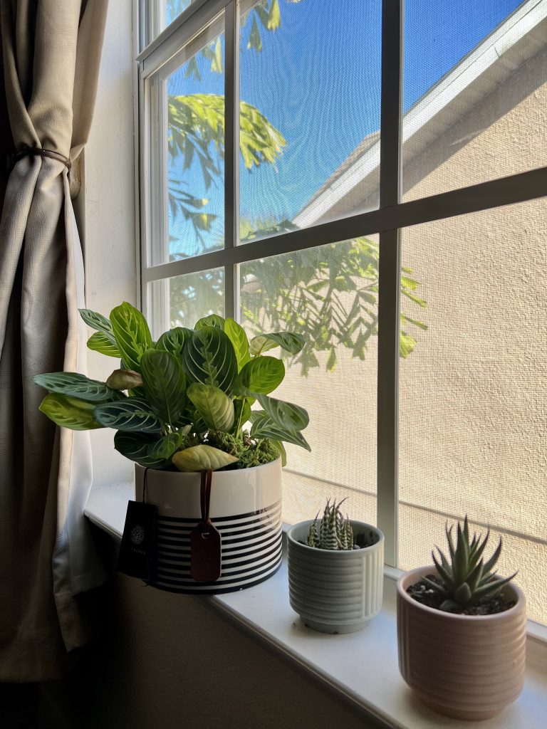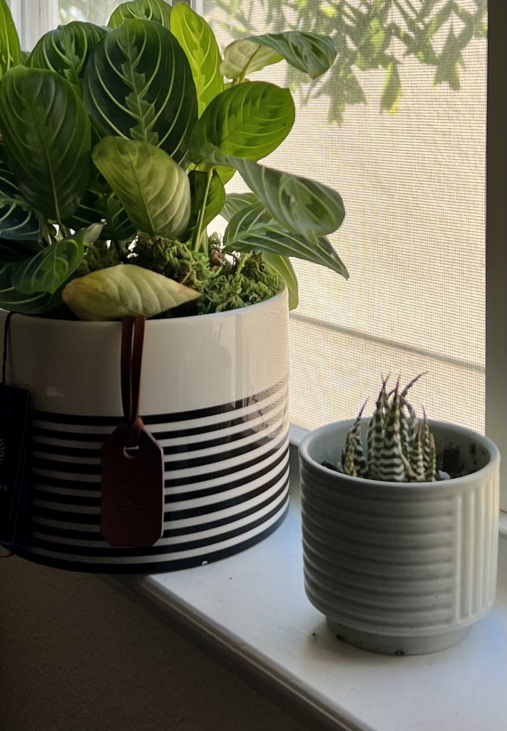
I chose my newest indoor plants in selecting an image for this week’s project. These plants are placed next to my WFM desk. In the original photo (featured above), there are many vivid colors/background noise behind the plants between the sky, outside trees, and windows. I wanted to create a more focused and new narrative by eliminating the plant closest to the viewer. Using the rule of thirds and my grid line, the new image is now centered with the most significant plant located in the top-left grid and the succulent situated at the bottom right of the grid. This creates more focus and light for the two plants and brings the plants closer to the viewer than before. It also enriches the main plant’s color than before. I also like that the plants are neatly lined up and centered in the original. The cropped photo centered the two plants while also cutting off a chunk of the main plant, almost like getting a hair cut! The cropped image simplifies the background more than the original.
And just like that, then it became two plants.


Hi Cynthia!
Your cropped image certainly changes the meaning of the original. The first shows plants in a windowsill with a possible undesired background. Its focus is around the whole window to even include the curtains on the side. The cropped image, however, changes that focus to just the two plants. It does not matter where they are placed now as the background is irrelevant. My eyes shift to the color variations in the leaves and the color/texture of the pots. It tells a story about the plants versus where the plants are placed.
Another way the image could be cropped would be to remove the large plant and only include the two smaller ones. This would focus more on the smaller details of the leaves, soil, and pots. It would also completely remove the tree in the background to further focus only on the plants in the frame. My suggestions for this post would be to include URL links for your created copyright. This would allow readers like myself to further understand what I am allowed to do with the photo and provide reference to read if I did not comprehend. Otherwise, great job!
Cynthia!
First of all I really enjoyed your choice of image and crop because of the simplicity of the subject! It’s so nice to be able to see this exercise with an image of something that is truly the every day. When I was in art school we got taught about composition by thinking about “What if the smallest thing in the composition was now the biggest?” I feel like this post absolutely does that because you took two of the smaller elements and made them the absolute predominant part of the composition. Great job and great image and choice of subject!