
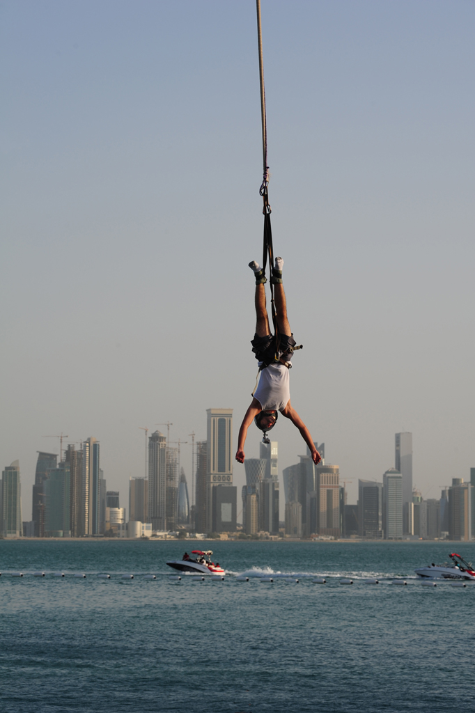
“Bungee Jumping at the Peal Qatar” by SJByles is licensed under CC BY-SA 2.0.
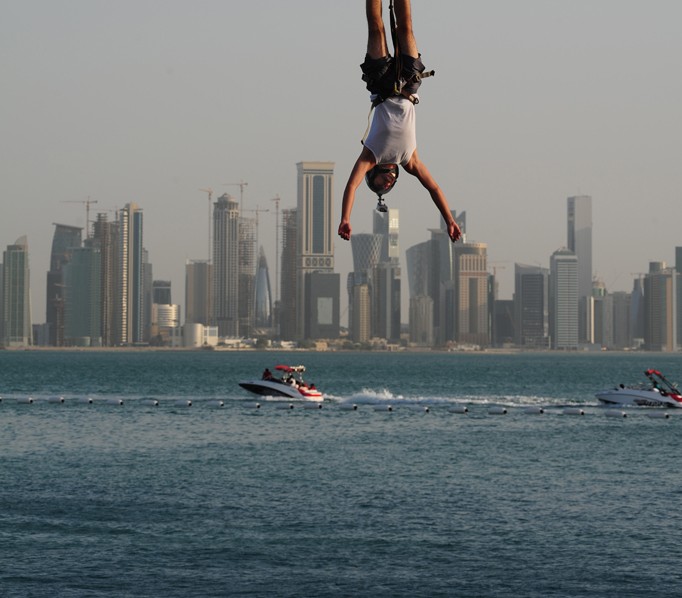
“Innocent Skydiver Accidentally Destroys Downtown” by Aedan Bennett is licensed under CC BY-SA 2.0.
I chose an image from Creative Commons because I wanted to see if I could change a stranger’s photo to mean something completely different. The original photo is of a bungee jumper over the water in Qatar and he is the focal point of the image along with the long rope above him that contrasts plainly with the open sky of the top half of the original.
In the second image, he is transformed into a giant skydiver who finds himself hurtling down towards the city below him, about to destroy it. By cropping out the rope and removing the top half of the image, the image lacks context and while, of course, no one would read this new image as a giant skydiver, it shows the way cropping and framing are important to give context for the photos you take, especially about who the subjects are and what they are doing.

This is such a cool change for this photo. It is interesting to see the difference in meaning just in the way you cropped it. The shift in focal point has really changed what you would interpret is happening in this photo. For me if I were scrolling through social media or photos someplace on the internet I would be more likely to stop and take a closer look at your edited version because what you see at first glance is more of a “showstopper” than the original photo.
Hey Aedan – I can see how the cropping removes the context from the original photo, and gives a sudden “double-take” effect to the photo, as I’m wondering why is this man falling headfirst. I think further cropping could have been done to the right side, where some of the jetskis take a bit of the focus away.
Hi Aeden! That’s a really cool photo you found! I liked how you cropped out the sky and bungee cord. It cuts out a lot of the empty white space, and draws us closer to the subject person by making him comparably larger in frame. The background—the sky, the buildings, and the water—are all similarly colored and feel the same to me, so I appreciate you bringing the man seemingly closer to the audience. In fact, I wouldn’t mind if you highlighted him even more. I also enjoyed how you reimagined the story behind the image with the cropping.