
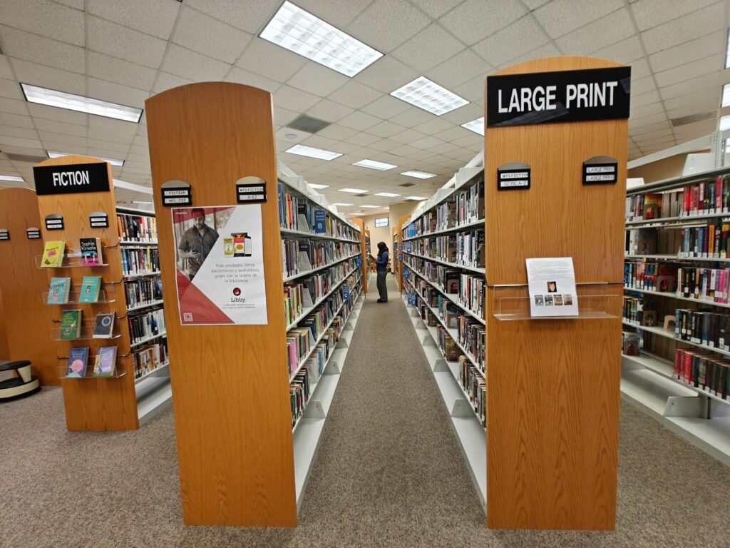

I took this photo at the West Hernando Branch Library. Every year, we have a list of photos we are required to take, one of which is of a patron browsing the collection (this is actually a staff member). The original is fine; it covers that requirement, but it does not follow the rule of thirds. Cropping the image, I aligned the subject along one of the vertical guidelines. The lines of the shelving units guide the viewer to the subject but also extend out towards the viewer. The prominence of the poster on the end cap was unintentional, but it makes for a creative promo image for Libby

Hi Troy, This image is such a great example of leading lines and you did a great job of following the rule of thirds. Personally, I wonder how it would look if you changed this photo to vertical from horizontal and the reason I mention this is because that Libby poster is really distracting me from the focal point of the image! I would probably try to cut out all the overhead lights (which you basically did) and if the file is large enough, even cut out that window above her head, putting her in the upper right third of the image, keeping all of those lines of books leading directly to her. In any case, you have definitely improved the image with what you’ve done here. Very nice!
Hey Troy, there’s a huge difference between this photo’s before and after, and I think your work does an especially great job of showing how leaving out unnecessary details can elevate the story being told in a photo (less is absolutely more!). In the first photo, my eyes go straight to the aisle signs that say “LARGE PRINT” and “FICTION,” then to the books in the aisles, before finally land on the browsing staff member. In the second photo, the aisles not only follow the rule of thirds but also lead the viewer to the focal point (the staff member) through diagonal lines, making this an incredibly aesthetically pleasing image.
Hi Troy, the contrast between the two images is really striking. As Alih mentioned in her post, the uncropped version naturally pulls my attention toward the details along the sides of the shelves, which makes the overall focus feel more dispersed. Once the image is cropped, though, the subject becomes much clearer. You can immediately see the person, and the composition falls nicely within the golden ratio, which gives the photo a stronger sense of balance and intention. It’s interesting how a simple crop can shift the entire visual impact.
Hi Troy, I love how the focus on the cropped image has changed the focal points for your picture. In the original, I am distracted by the noise of the lights and signage; however, once you’ve cropped it down, the staff member is truly the focus! The leading lines of the row of books draw your eye directly to her. I agree with Karen that this could have been even more reinforced with a vertical aspect, but I can see how that would have lessened the guiding lines to her, while also limiting how much “noise” was edited out with the overhead lights (which are very prominent in the original).