
License: CC Public Domain Original image: Flickr
CROP: “Faces” by Elizabeth Anderson is license under CC0 1.0 Universal (CC0 1.0) Public Domain Dedication
I tend to gravitate towards a black and white color palette. Black and white images, black and white clothing. I think there is something very emotive and chic about focusing on shadows and relying on the composition. This is why designers tend to design logos in black and white first because you can focus on composition and not get distracted with color.
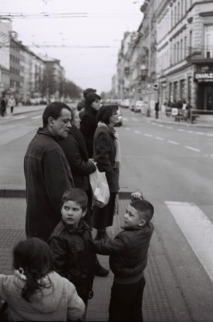
The original image is actually really nice. The composition creates an interested split between the bright, open section and the darkness of the cluster of people. It creates a strong sense of airy (sky/street) vs dense (people).
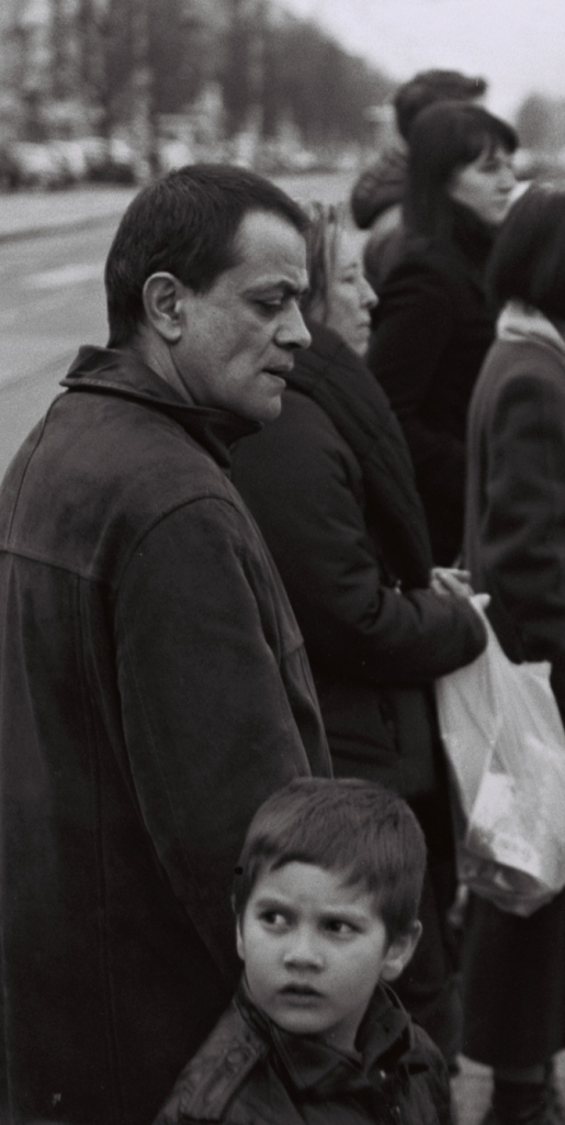
In my crop I wanted to focus in on the faces I actually found to be the most interesting, because when you close in on the man’s face, his facial features and expression are somewhat puzzling. is he angry? Confused? Annoyed by the kid? Then we get to the kid! That side eye is everything. Who’s he looking at?
There is a real narrative that comes forward when this image is cropped like this and you also get a much more constricted view of the man/child. His back is literally up against a wall and in both but his face and the space in front of him is much more limited.
Entire stories can come from one image even when we aren’t 100% sure what we’re seeing.


Hi Elizabeth!
It is quite interesting to see how the cropped image tells a different story and creates two new main characters. The original portrays people just waiting for a crosswalk light whereas the cropped image is more personalized. As you mentioned, I am curious and find myself wanting to know the man’s emotion and where the boy is looking. Also, the original has many external factors and backgrounds. The cropped one eliminates the background noise and is much more personal.
Another way the image could be cropped would be to put the woman in the middle of the original on the left one-third line. This could create another story of her ponderance. What could she be thinking about? It would leave space on the right to allow thought of where she is staring as well. Another crop would be to focus on the children as they seem to be staring at the same thing. The only suggestion I have for improvement would be to remove one of the original image URL links. There are two that go to the same webpage. Otherwise, excellent job!
Hello Elizabeth!
Awesome job on cropping your image! It definitely changed the meaning of your original photo. It brings a dramatic yet focus effect on both the man and the boy’s face and emotions. There were multiple ways of cropping the image, for example, focusing just on the women in the back to give the story another narrative as they are all staring in the same direction. Your image is actually perfect as it contains multiple narratives that it can be cropped into. I think you did great in following the rule of thirds and dismissing the background noise to create this new story, honestly, I am living for the little boy’s side-eye. 🙂