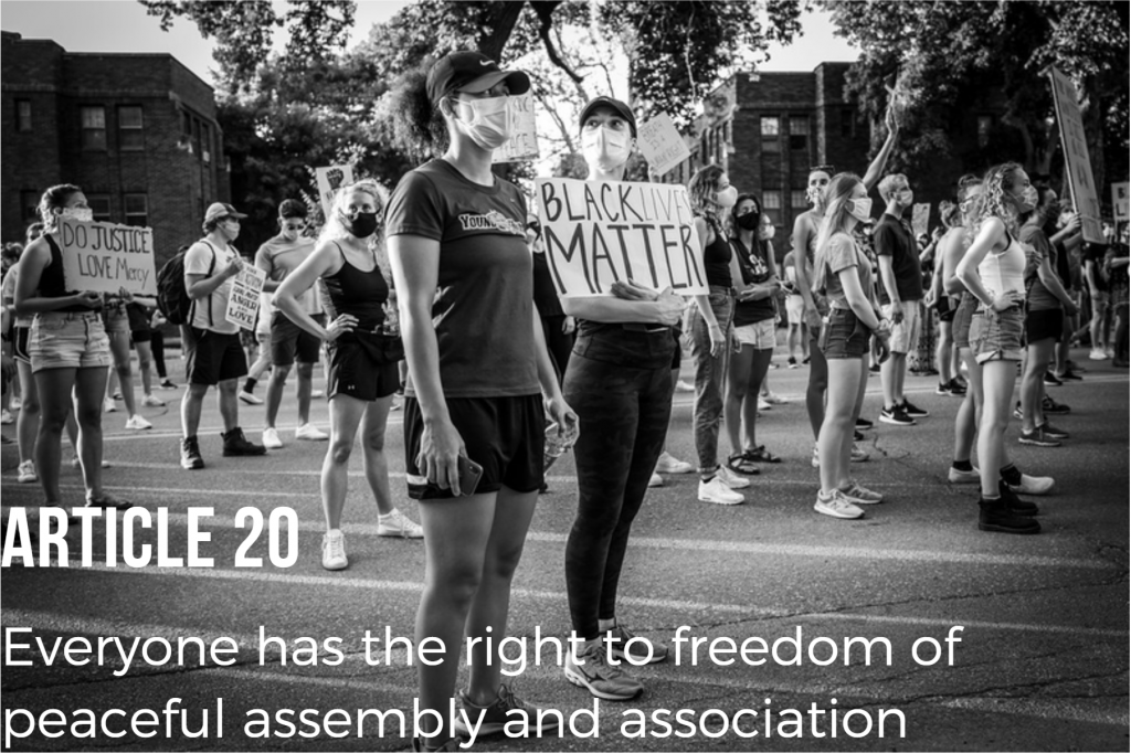
Freedom of Peaceful Assembly “Freedom to Peaceful Protest” by Joel Vasquez is a derivative of “Big Crowd, Peaceful Protest in Des Moines” by Phil Roeder is licensed under CC BY 2.0 originally downloaded on 2/8/2022 and edited on Canva. Tags: human rights February 8, 2022 by Jane Barrager Student Posts 2


Hi Joel!
I like the font styles you used for this image. The boldness make it easy to read. Due to the heavy nature of the words and image attached, I might have gone for an even more aggressively bold font, but I would be worried it might also take away from the image. I also like that the color is white, as it does not distract from the black and white photo and is easy to read. Any other colors probably wouldn’t have worked well. The fonts are different enough for me to realize they weren’t the same, but do work together very well, and looked natural upon first glance. Again, my only suggestion might have been to use an even more aggressive font (maybe more blocky letters and sharper lines) for the sentences in the article. Otherwise, great job, I like it!
Hi Joel,
I really loved the postcard you created for the Typography Media Lab 4 assignment. I liked how you used a black and white photo juxtaposed with the white typography to make a powerful statement. The statement of your photo was Article 20 Everyone has the right to freedom of peaceful assembly and association. The design principles you followed in your postcard was text alignment with the Article and copy aligning to the left. The only suggestion I have is to allot a little more padding to the left of the text. The text is bumping up to the edge of the photo frame.
Again, I love the black and white photo and the sign the young lady is holding which says Black Lives Matter (BLM). In summary, I think the black and white photo along with the juxtaposition of the white typography makes this a powerful postcard.